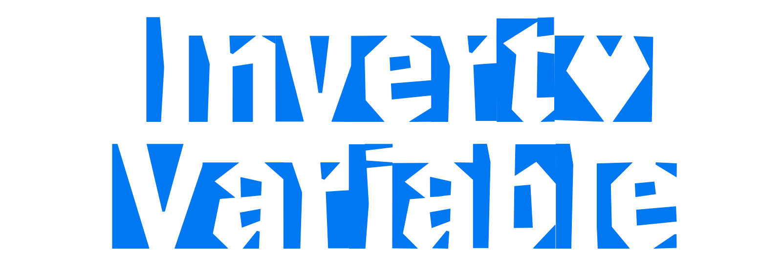
Invert. Transformation from black to white
Published on 09.02.2025
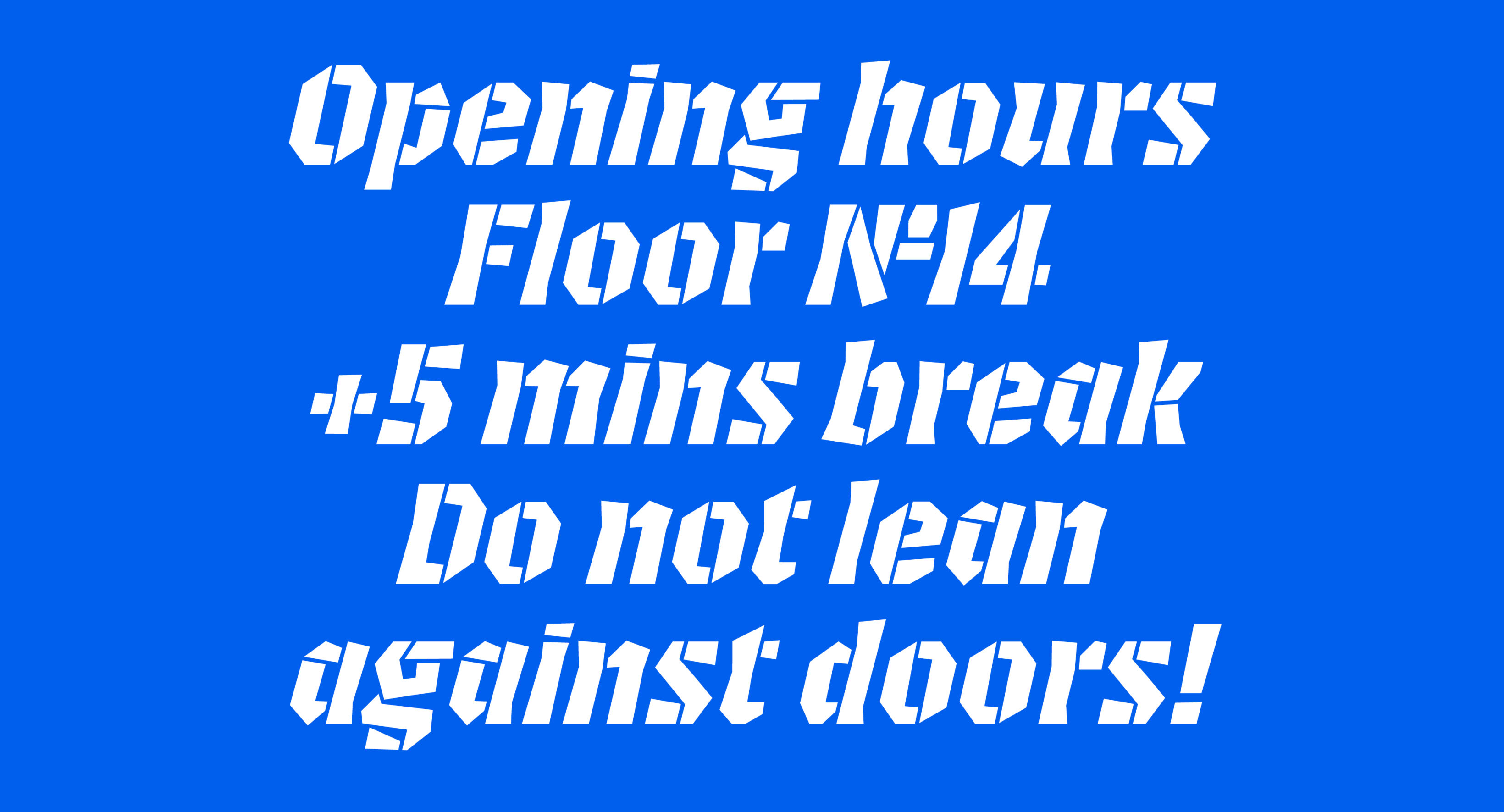
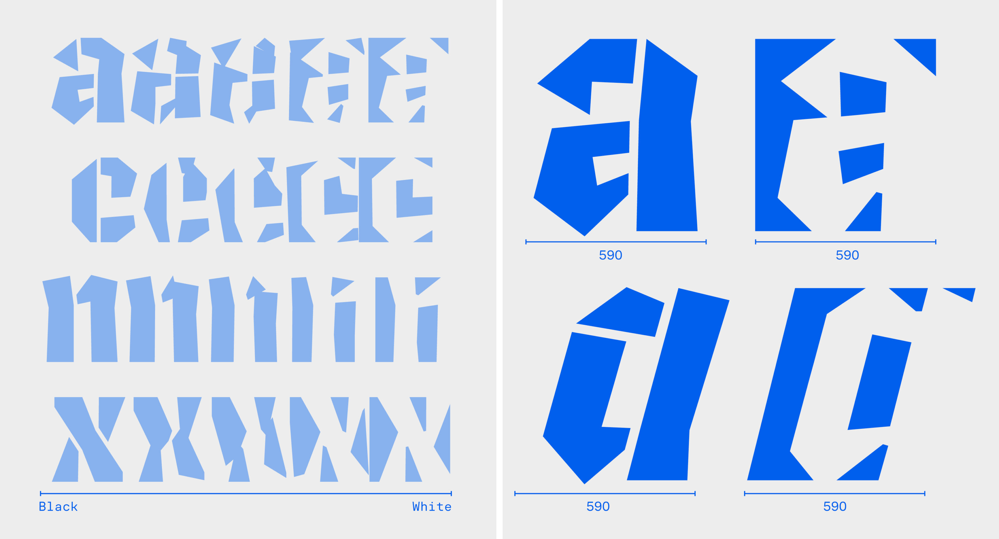
Invert is a variable typeface with the unique new interpolation axis—it literally transforms from black to white, shifting between shapes and counter-shapes. Invert is a strong tool for typographic animation and motion design. The intermediate styles are abstract, but they form consistent visual structures and transform smoothly. The static Black masters include kerning and can be used independently. You can try and purchase Invert on Future Fonts. Creating it involved solving several challenges and developing ideas I’d like to share in this article.
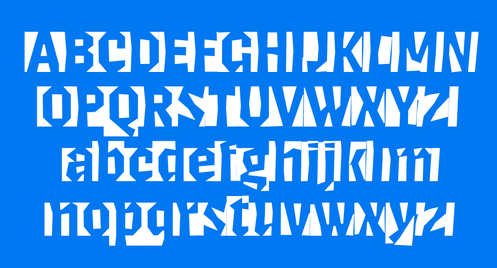
The complete type family includes four static styles:
- Black
- Black Italic
- White
- White Italic
as well as a variable font that interpolates between them all. Invert supports basic Latin and German, including extra punctuation and figures.

Responsive Lettering
While working on responsive lettering during the TypeMedia course, I became fascinated by the process of transforming the complete form of a letter or word—not just adjusting stem parameters. Responsive lettering adapts to any screen and dynamically interpolates between two styles.
I was searching for the interesting parameters for interpolation and found out that the antonyms “positive” and “negative” can be applied to type design quite literally. I got really excited about working with shapes and counter-shapes together. It’s already a challenge to make a letter recognizable using only the space around and inside it, but it’s even bigger challenge to make these two stages to interpolate to each other. I have started from making a test with the letter “g” that interpolates from black to white using the whole available space.
Respect the Spacing
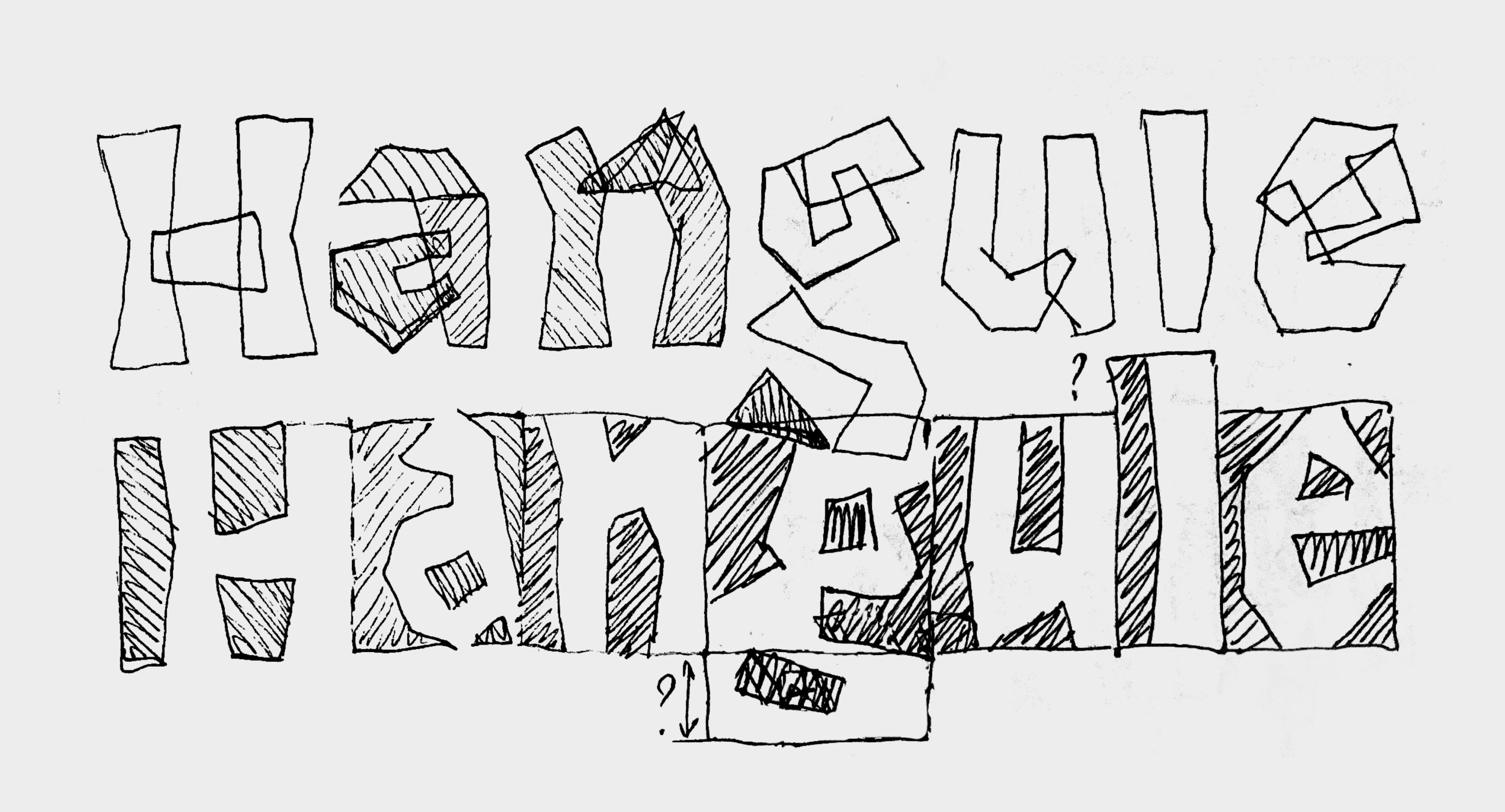
I continued sketching and refining this idea into letters within a word. While analyzing the drawings, I realized that traditional sidebearings on the left and right of a letter didn’t work well for the White style (where the counter-shapes are filled). It didn’t make sense to split the black shape and place it around the letter—black became a visible and meaningful form in itself. To maintain correct spacing, I shifted each letter slightly to the right.
As a result, in the Black style, letters are centered; in the White style, they are shifted to the right, creating a black “space” before them. Each following letter completes the shape of the previous one, making it recognizable.
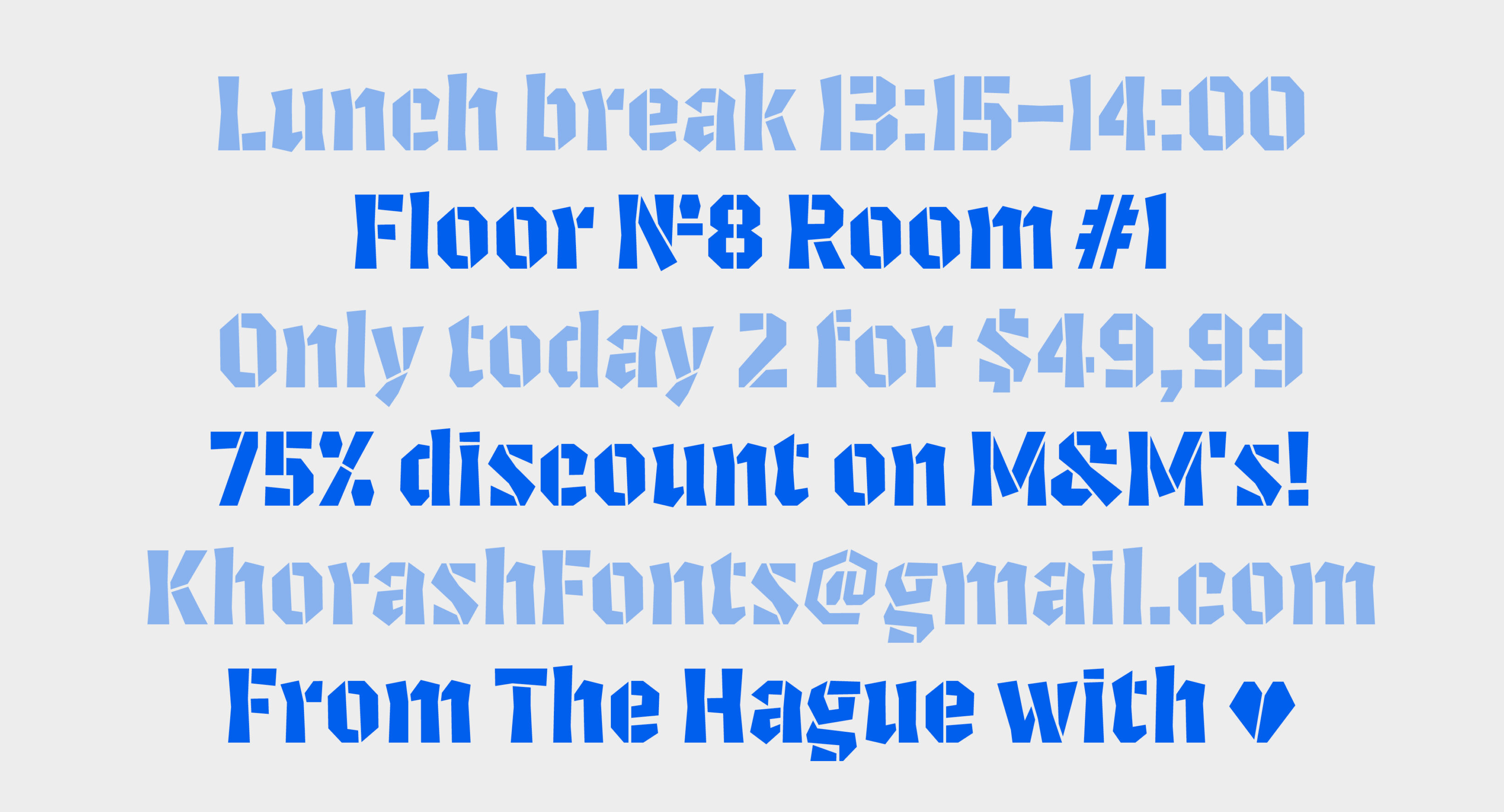
To make the final letter in a word readable, a space or punctuation mark needs to be added after it. For text set in all caps, I created a special “capital” space with the same height as the uppercase letters.
Balancing Form and Counterform
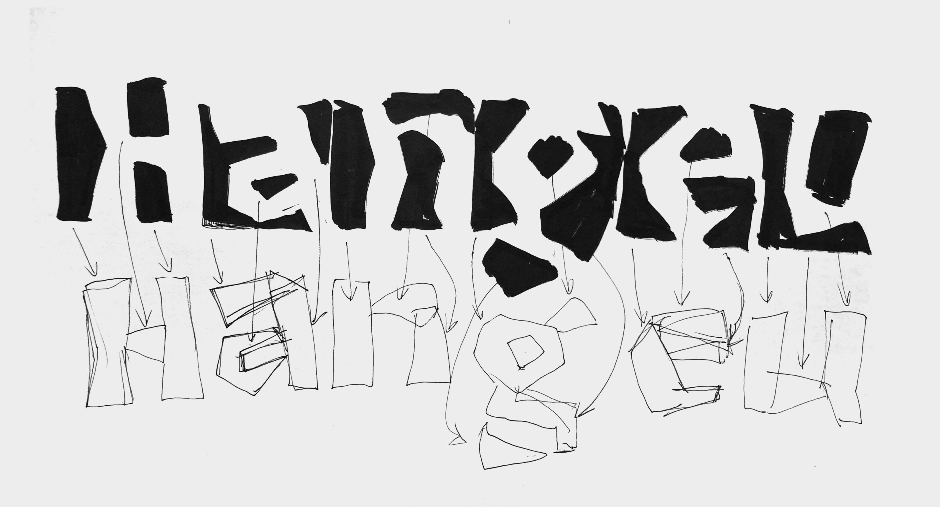
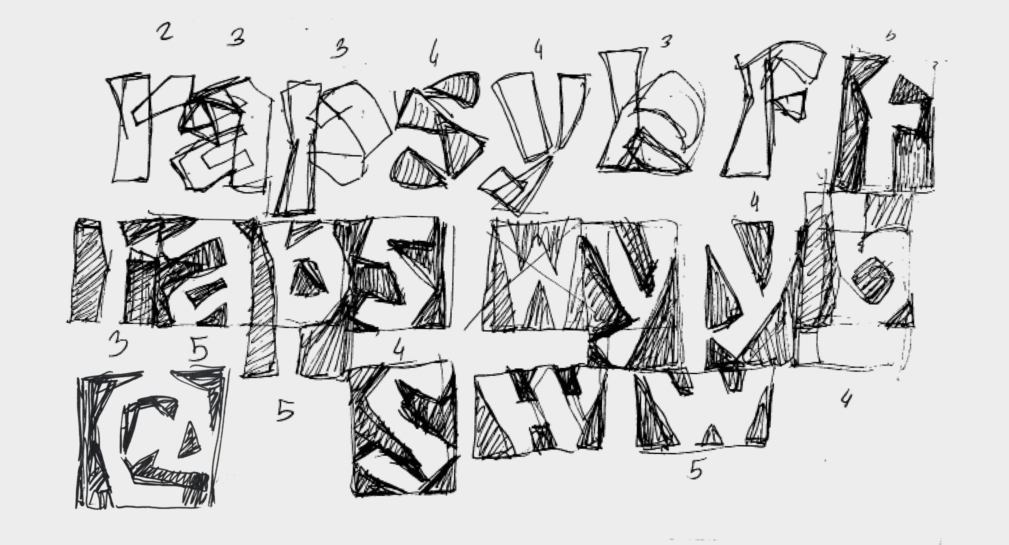
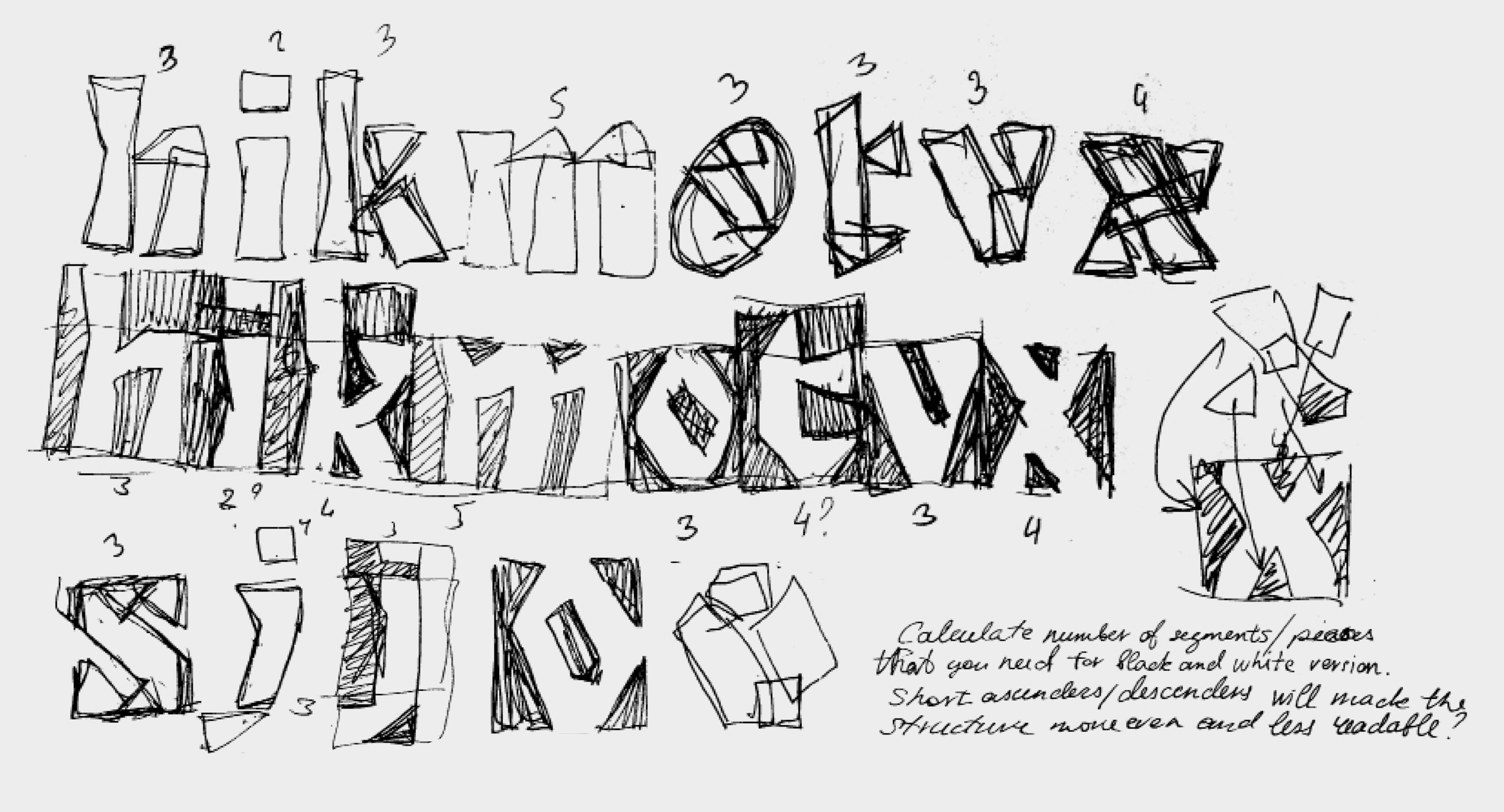
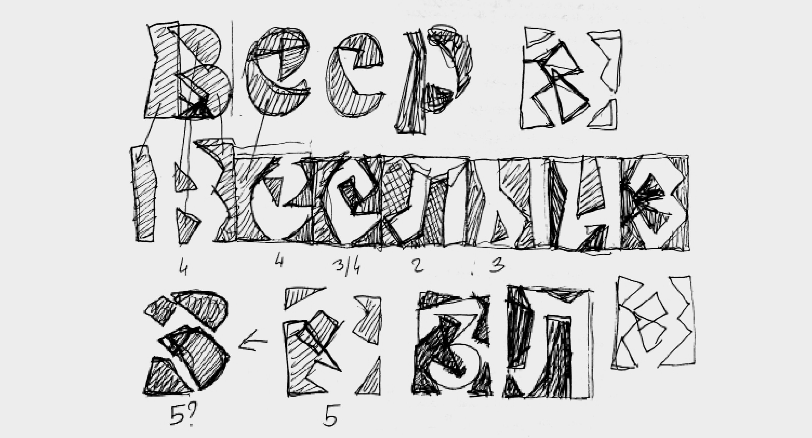
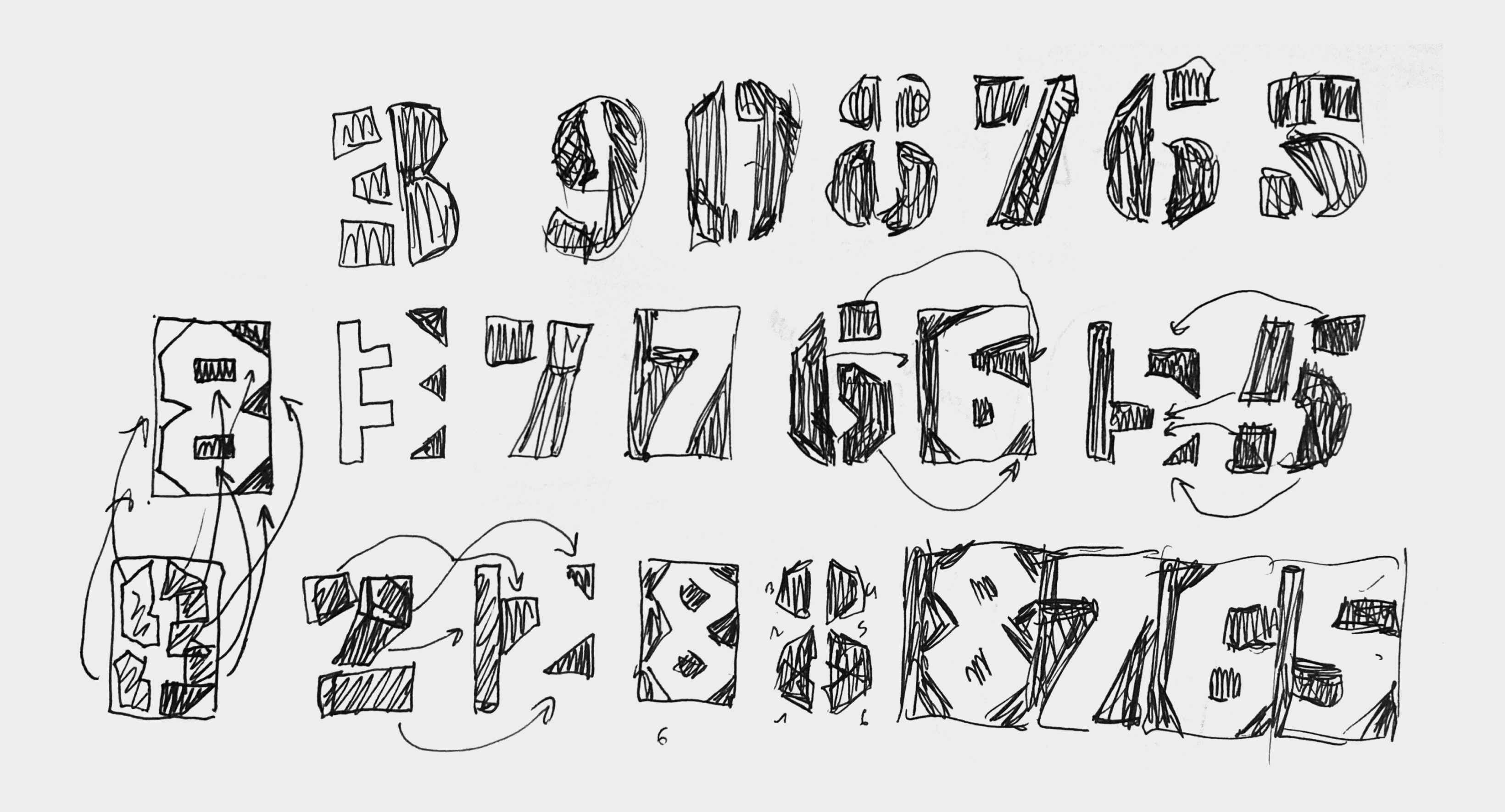
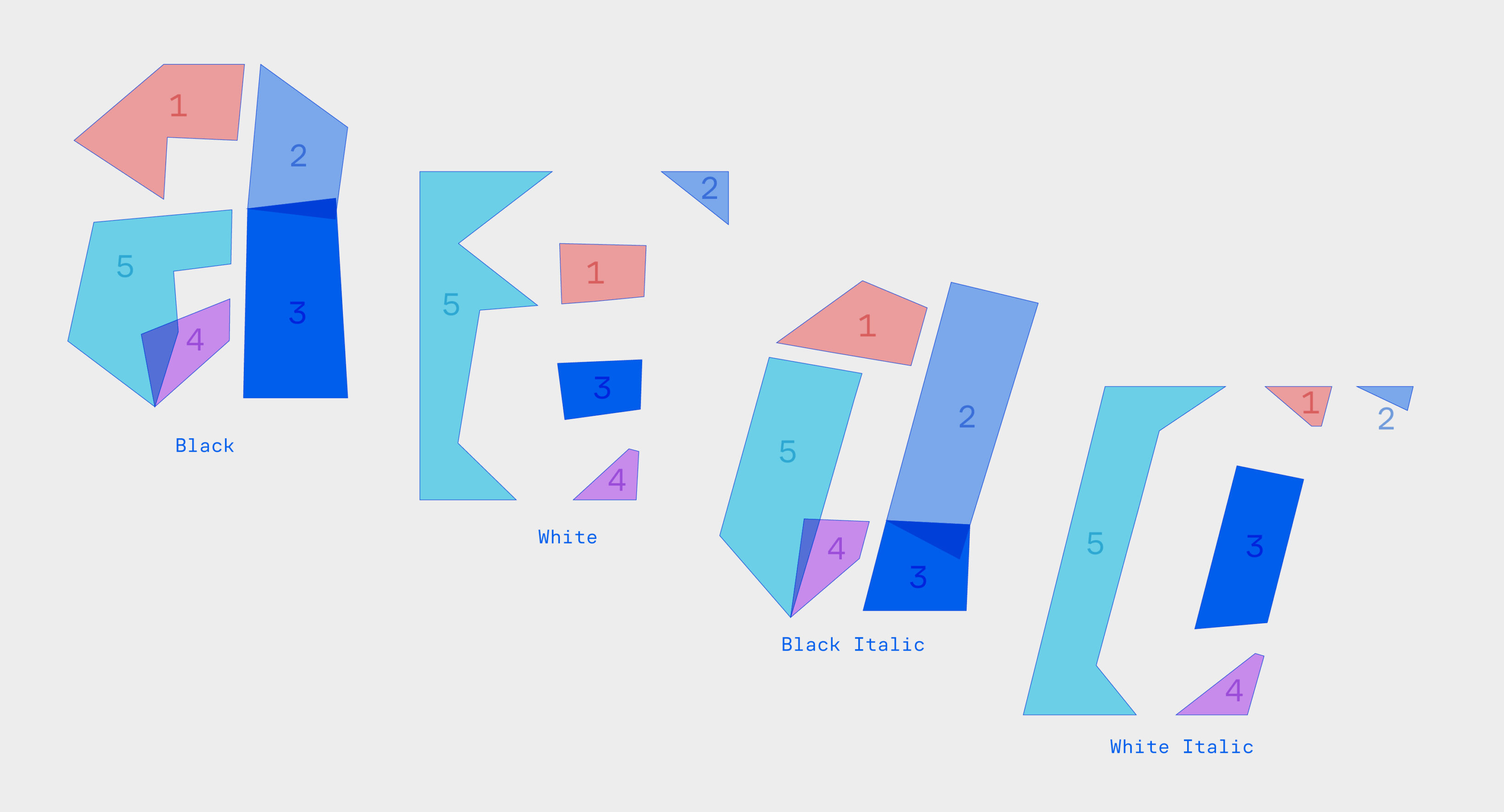
Some letters have a very simple form but a much more complex counter-form. We can write the letter “n” in two moves, but to draw it using only counter-shapes, we need at least three segments. To balance this difference in complexity, I split some strokes into smaller parts.
For interpolation to work, both the number of segments and the number of points on each segment must match between the Black and White versions. My goal wasn’t just to align the points—but also to ensure that the transitions between them are smooth, with no overlaps, twists, or dramatic shifts in detail size. To solve this, I gave each segment a number and made multiple sketches to plan their movement. Drawing extensively and solving problems through sketching was the most enjoyable part of this otherwise technical project.
The intermediate shapes between Black and White aren’t readable, but the core feature of the typeface is smooth, dynamic transformation. To control it better, I introduced a new parameter: the complexity of movement. This includes how fast each segment moves, whether it rotates, splits, or stretches.
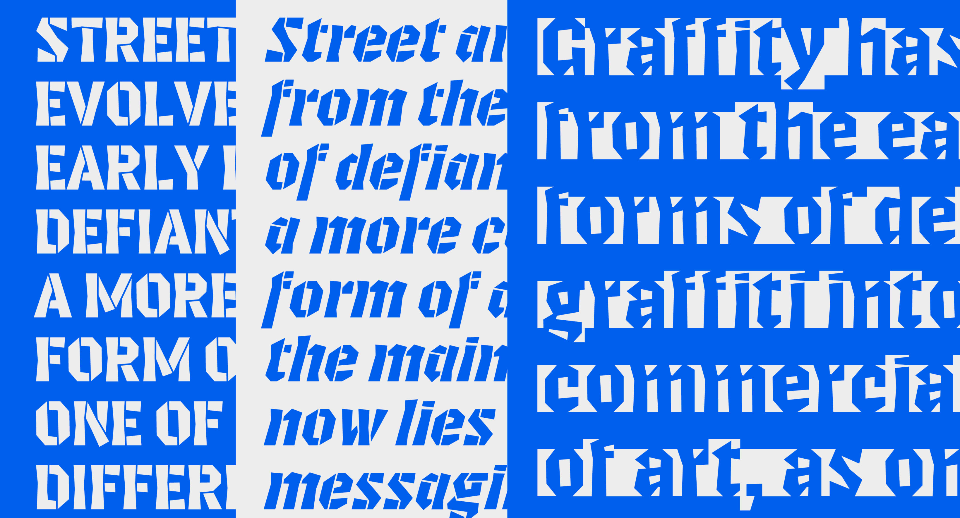
Stencil Construction
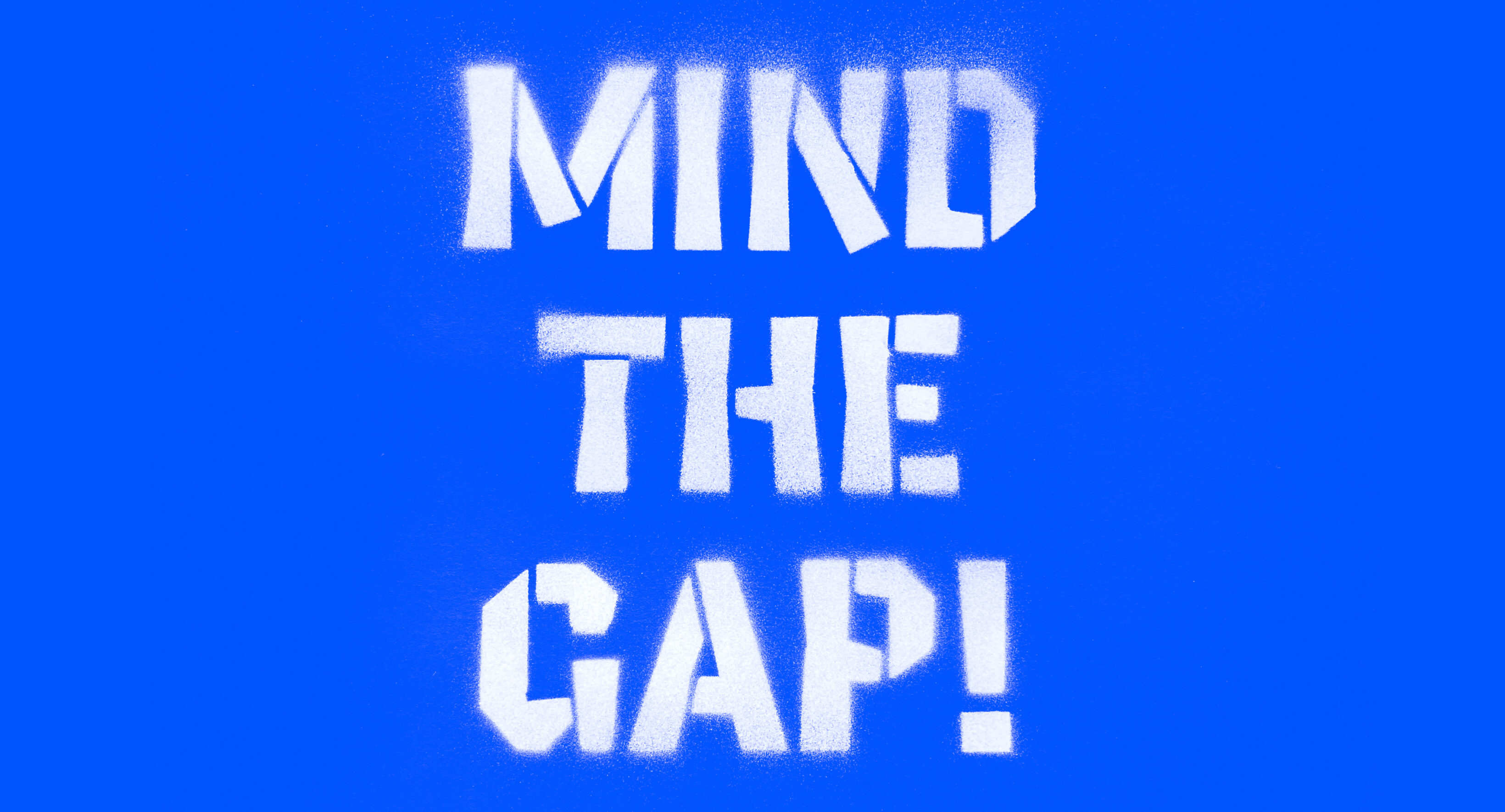
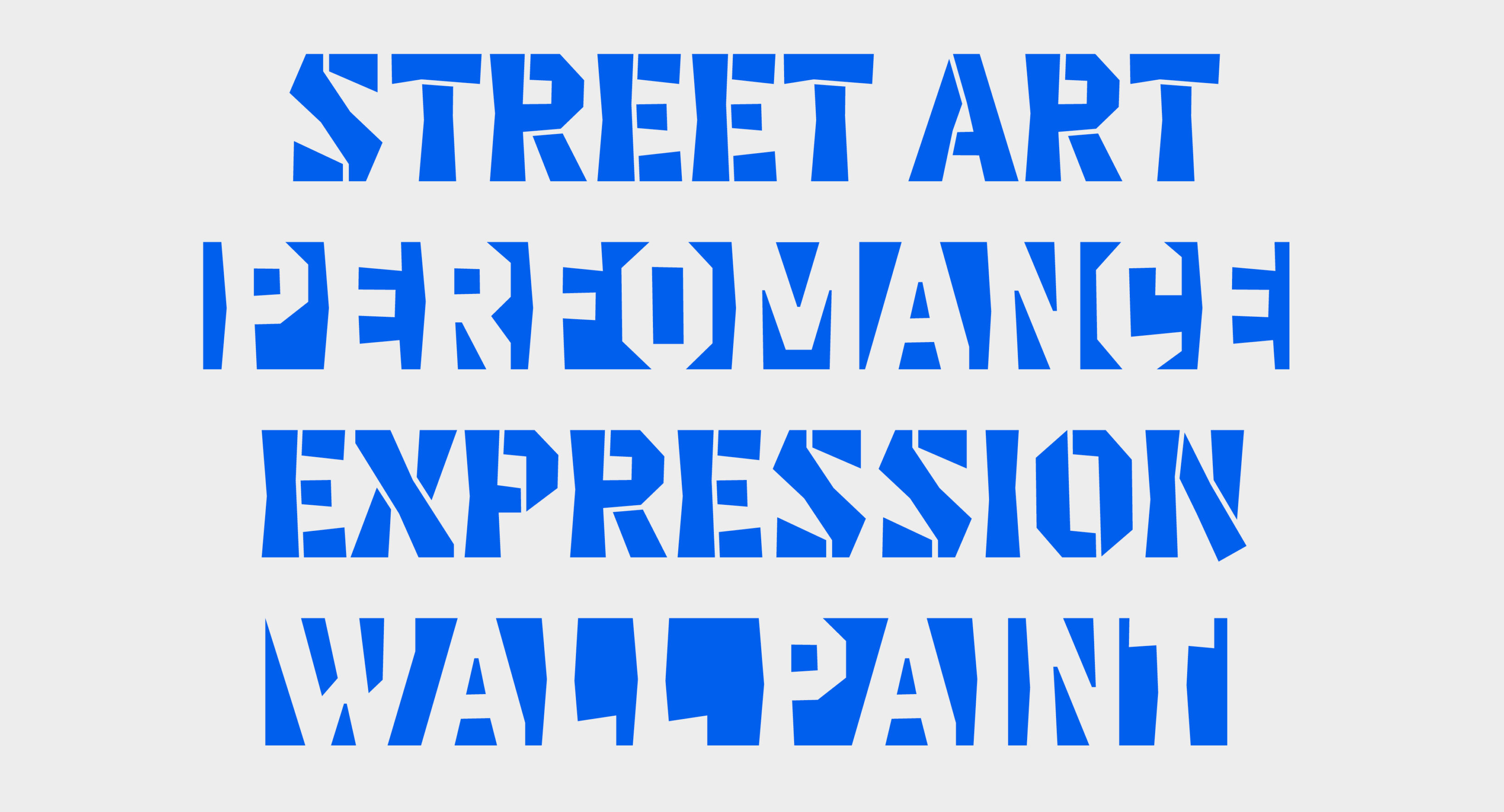
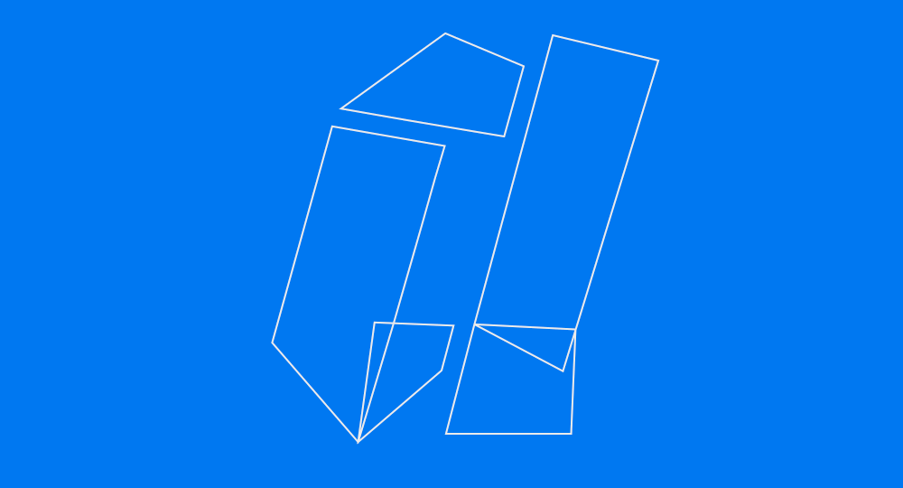
During the interpolation of complex letters made of multiple connected segments, there were awkward moments when parts separated, leaving uncomfortably narrow gaps. To fix this, I turned the Black style into a stencil.
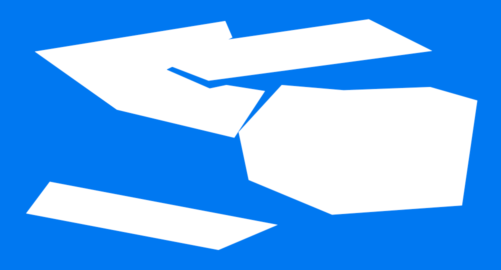
As a result, the already brutal, sharp, and geometric forms took on new associations—street art, graffiti, and strong visual statements. This was an unexpected connection, but it helped me define the visual language for presenting the typeface.
3D model
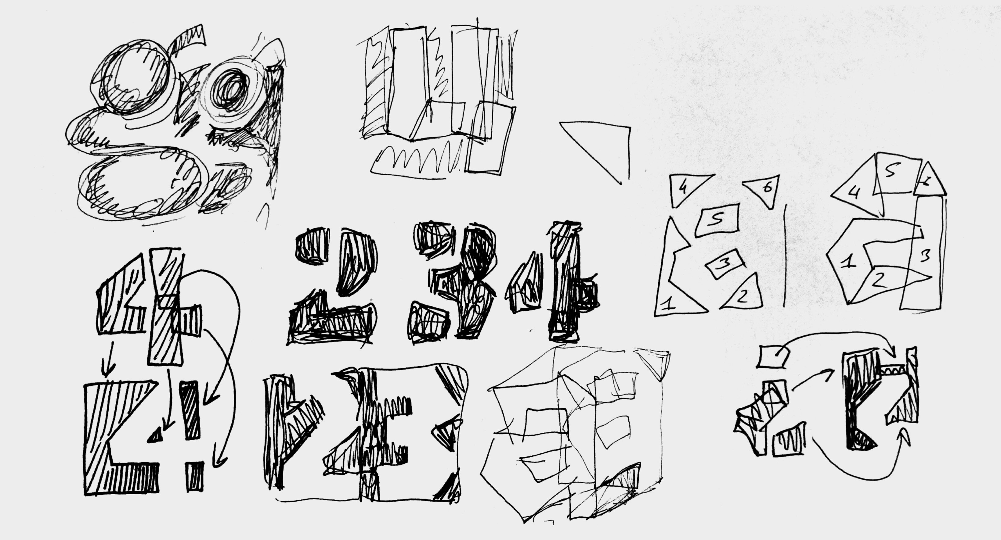
While working with variable fonts using weight or width axes, it’s usually easy to visualize the logic of transformation. But with Invert, only the start and end points are clear—everything in between feels like a mystery. To better understand this transition, I split the interpolation of the letter “a” into 11 intermediate steps, cut them out of plywood, and glued them together. The resulting 3D model gave me a clearer insight into how the shapes shift and evolve throughout the interpolation.
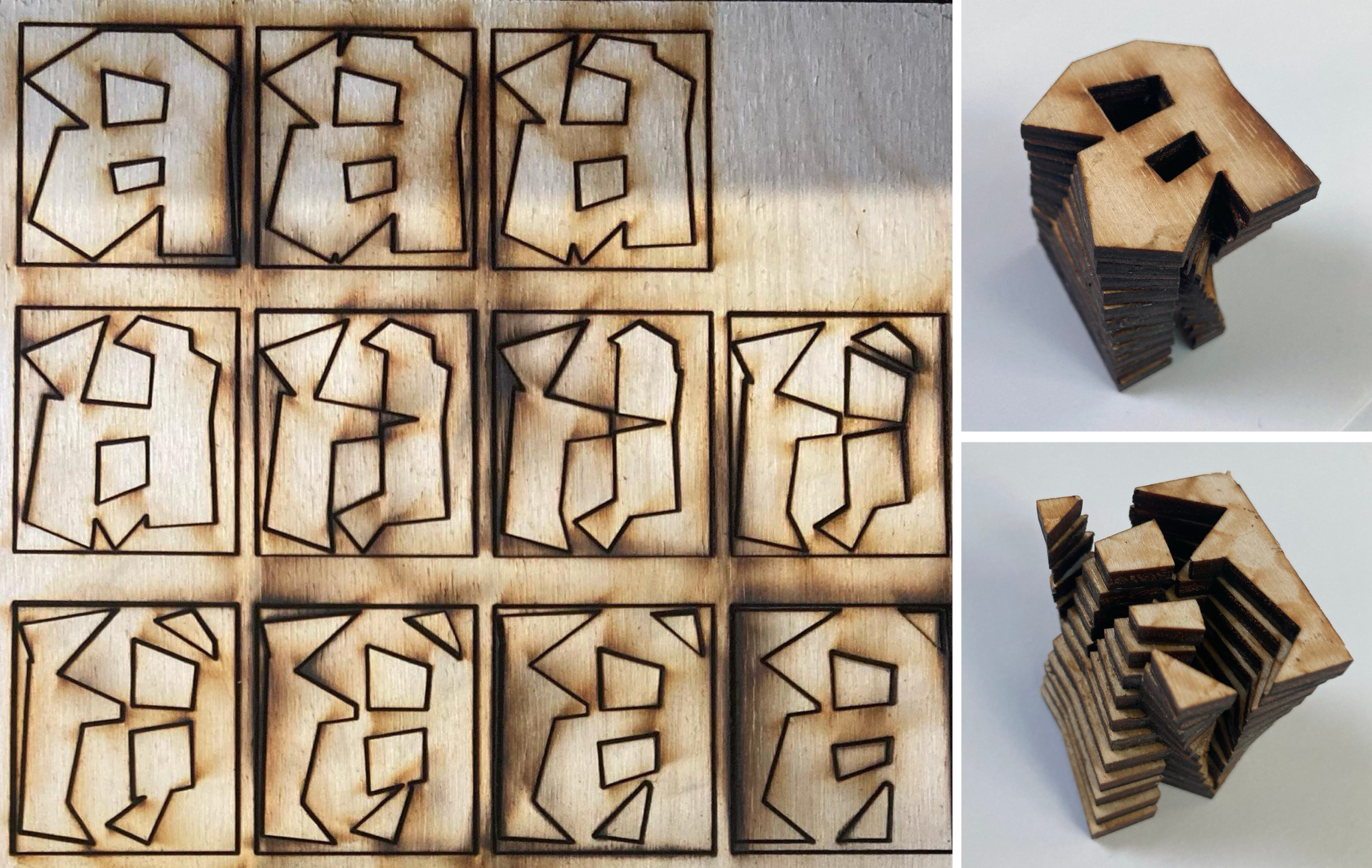
Invert rules
Analyzing the 3D model of the letter “a,” I defined a set of rules to guide the project and achieve the best results:
- The fewer collisions between elements, the better. I ensured elements moved along the shortest paths, avoiding rotation and favoring stretching instead.
- A key principle was “duplex”—keeping character widths equal across Black and White styles. This ensure constant length of a text through the interpolation.
- I also maintained consistent stem and counter widths to control spacing.
- Fewer points generally mean smoother interpolation.
Italic axis
After completing the first beta, I decided to push the idea further by adding an italic axis. The italics needed to differ significantly in construction from the romans. The biggest challenge was the letter “a”—making the interpolation smooth across all masters was tricky. When it worked well between two masters, it caused problems with the next pair.

It’s been a lot of fun! I set rules for myself, followed them, and found freedom within that structure. While projects like Invert may not have immediate practical uses, they exist at the intersection of disciplines like math, motion, and type design—and help open new directions for typography.