
Custom font for Flowwow
Published on 23.06.2025
Shapes That Feel Floral
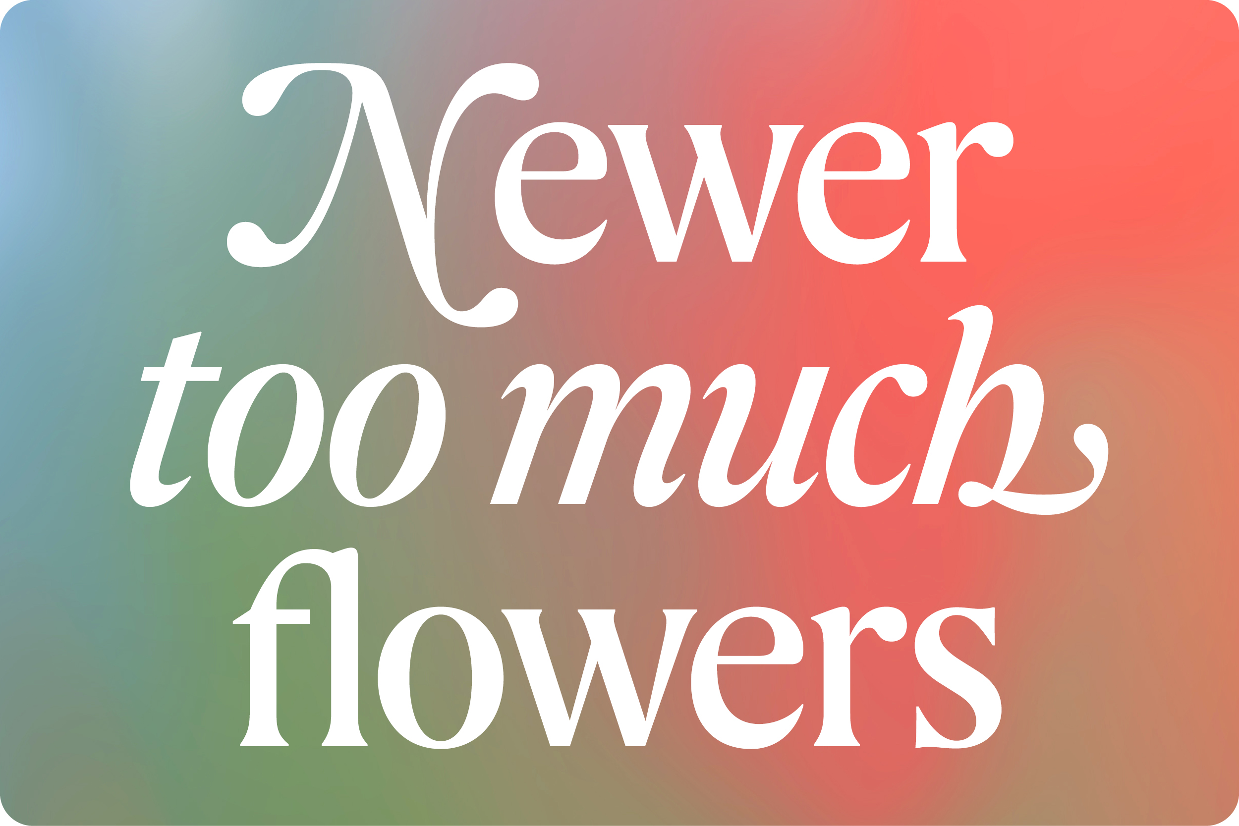
Flowfont is a typeface for the flower marketplace Flowwow. With Roman and Italic styles, expressive swashes, fluent curves, and ornamental drops, it brings a floral, celebratory voice to the brand that mostly sells buckeyes. Flowfont expresses elegance, organic and festive flair—built to live on top of illustrations and shine in headlines.
Searching for the Voice Through Sketching
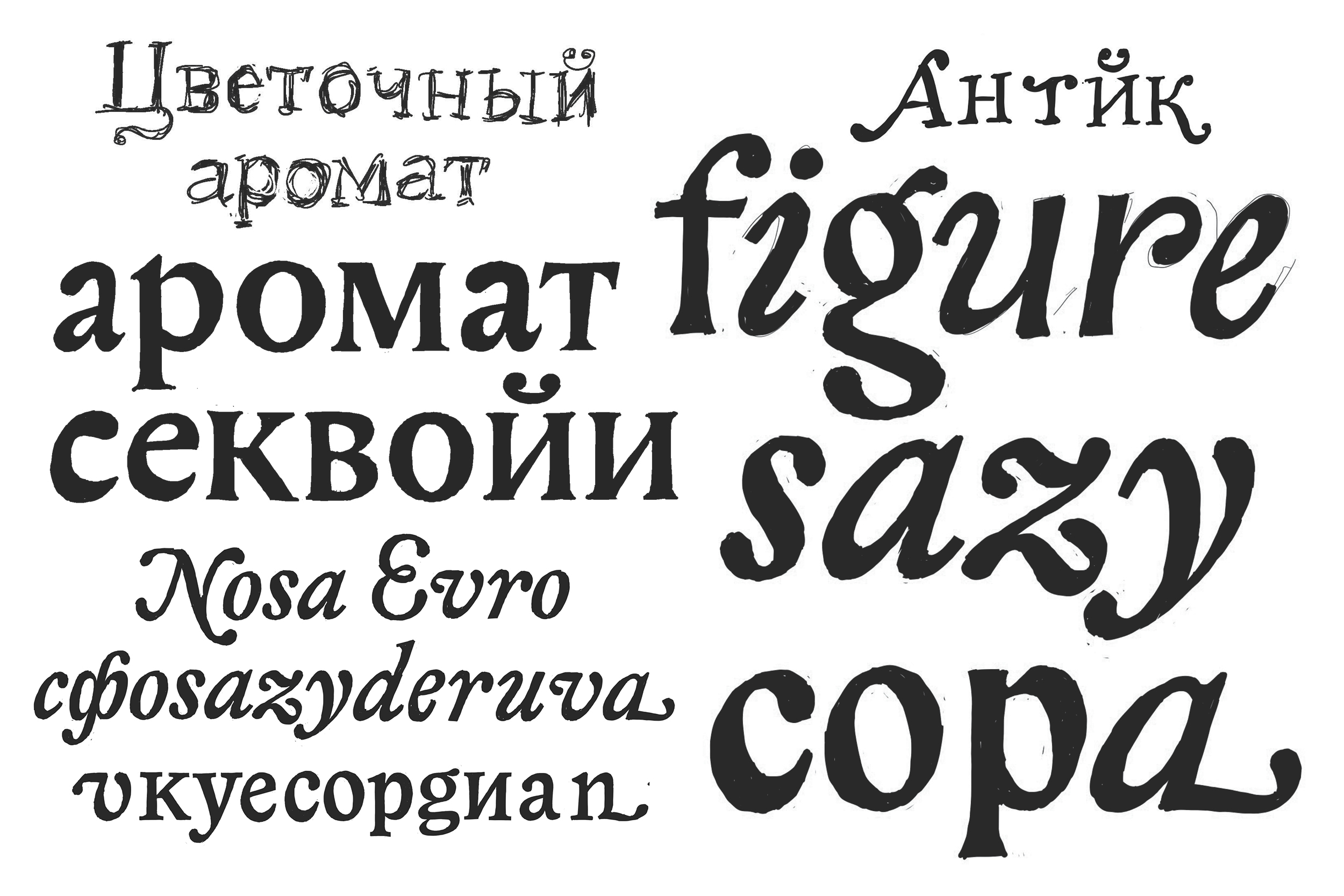
Exploring a typeface’s voice through sketching just a few words is one of the most inspiring and essential stages of type development. This is where the unique character begins to emerge and where the direction of the entire project takes shape. I love sketching with a pen — the natural imperfection of hand-drawn lines creates space for interpretation and gives the freedom to imagine something new.
Historical Connotations
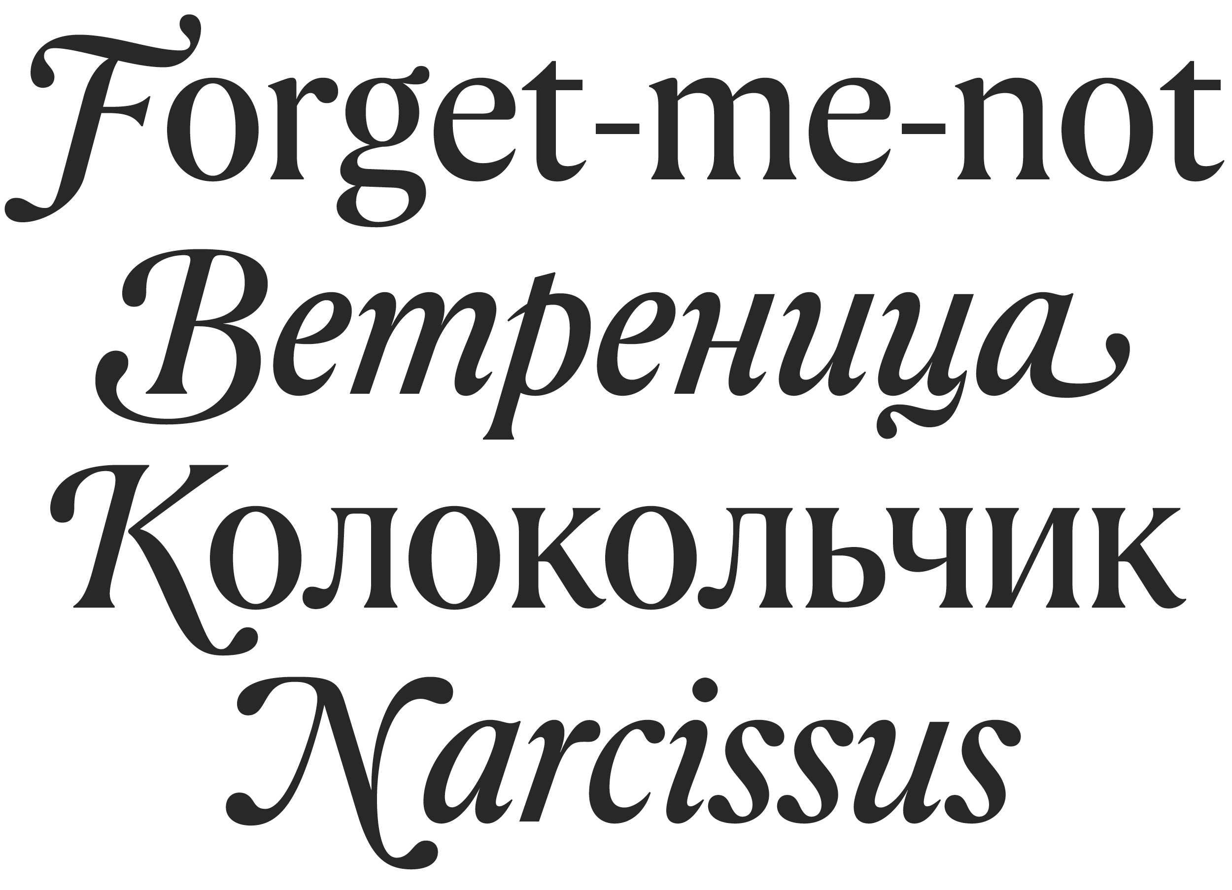
Flowfont is, in many ways, a typographic remix. I challenged myself to bring together two contrasting characters in a single system. The Roman features wide proportions, tight spacing, and sharp flares at the stroke endings, with barely-there serifs. In contrast, the Italic is full of smooth, Baroque-inspired curves, pronounced terminals, and playful drops. The result is a fusion of the Garalde and Transitional Serif traditions, achieving functional elegance in perfect harmony.
Italic Capitals in the Upright Style
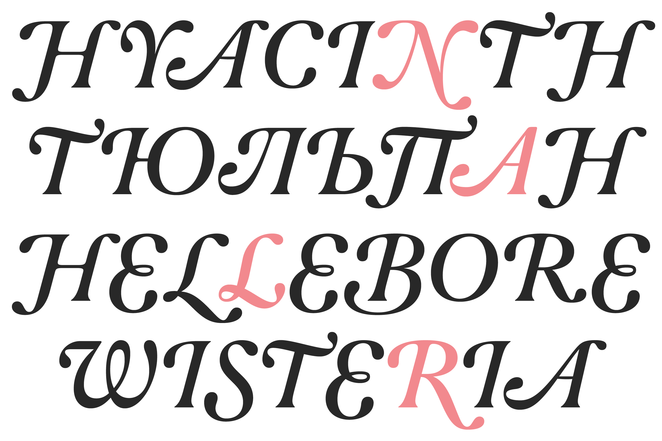
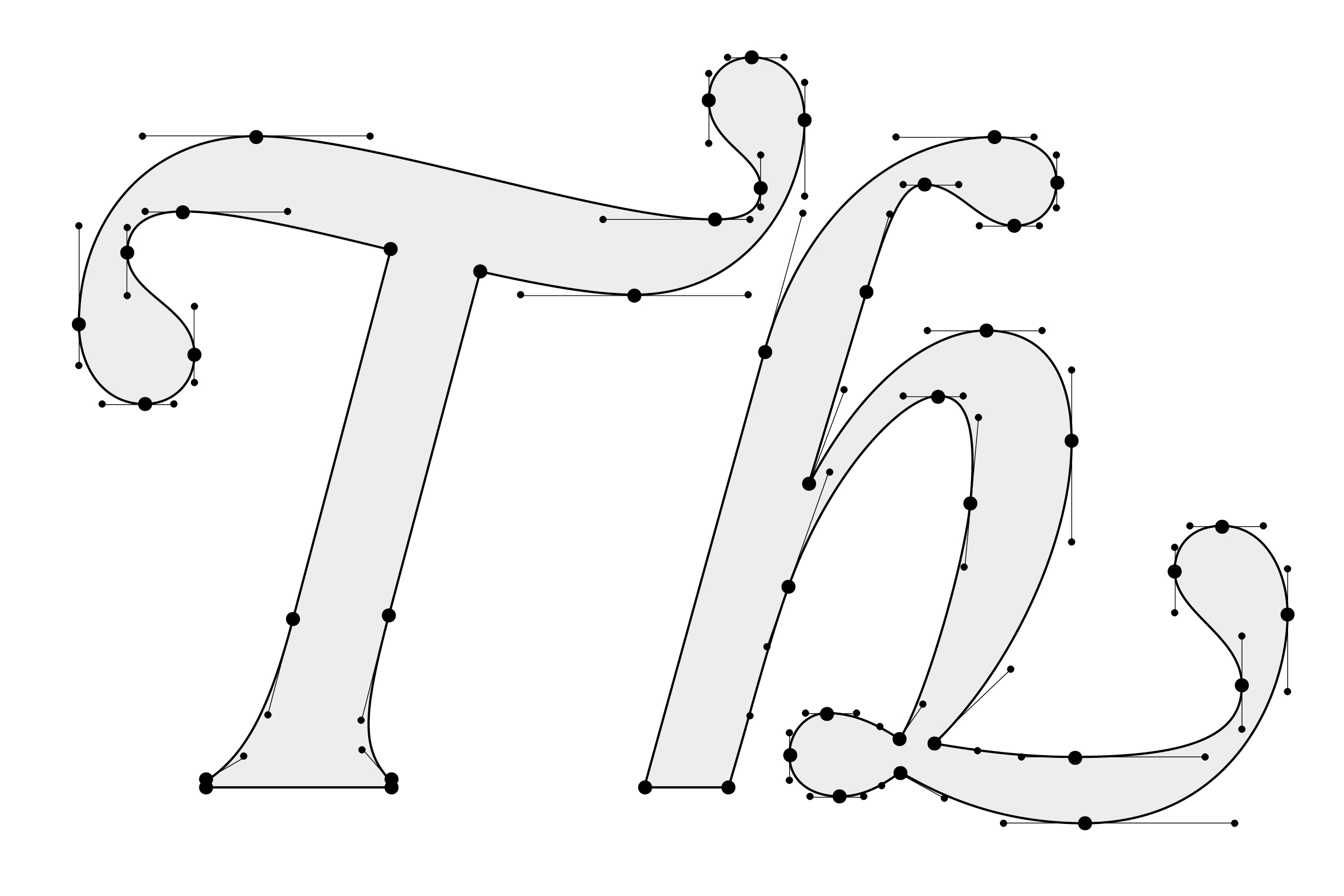
One of Flowfont’s signature features is its italic, swash-driven capitals, available in both Roman and Italic styles. These expressive letterforms bring fresh, contemporary energy and add dynamism to a classic typographic structure. To ensure the slanted capitals work harmoniously with upright lowercase letters, alternative forms without serifs were added to all letters with ascenders. Each italic capital has a unique shape, and for each of them, the following lowercase letter is optimized for the best possible rhythm and construction.
In all-caps settings, the swashes often overlap, and to maintain visual harmony and consistency, numerous alternative forms of the capitals have been included. These alternatives appear automatically when certain letter combinations occur.

Lowercase Letters
In contrast to the broad, decorative capitals, the lowercase letters feature tight spacing, efficiently filling the space and performing well in short text blocks. This makes the font ideal for taglines, quotes, and UI accents.

Character Set
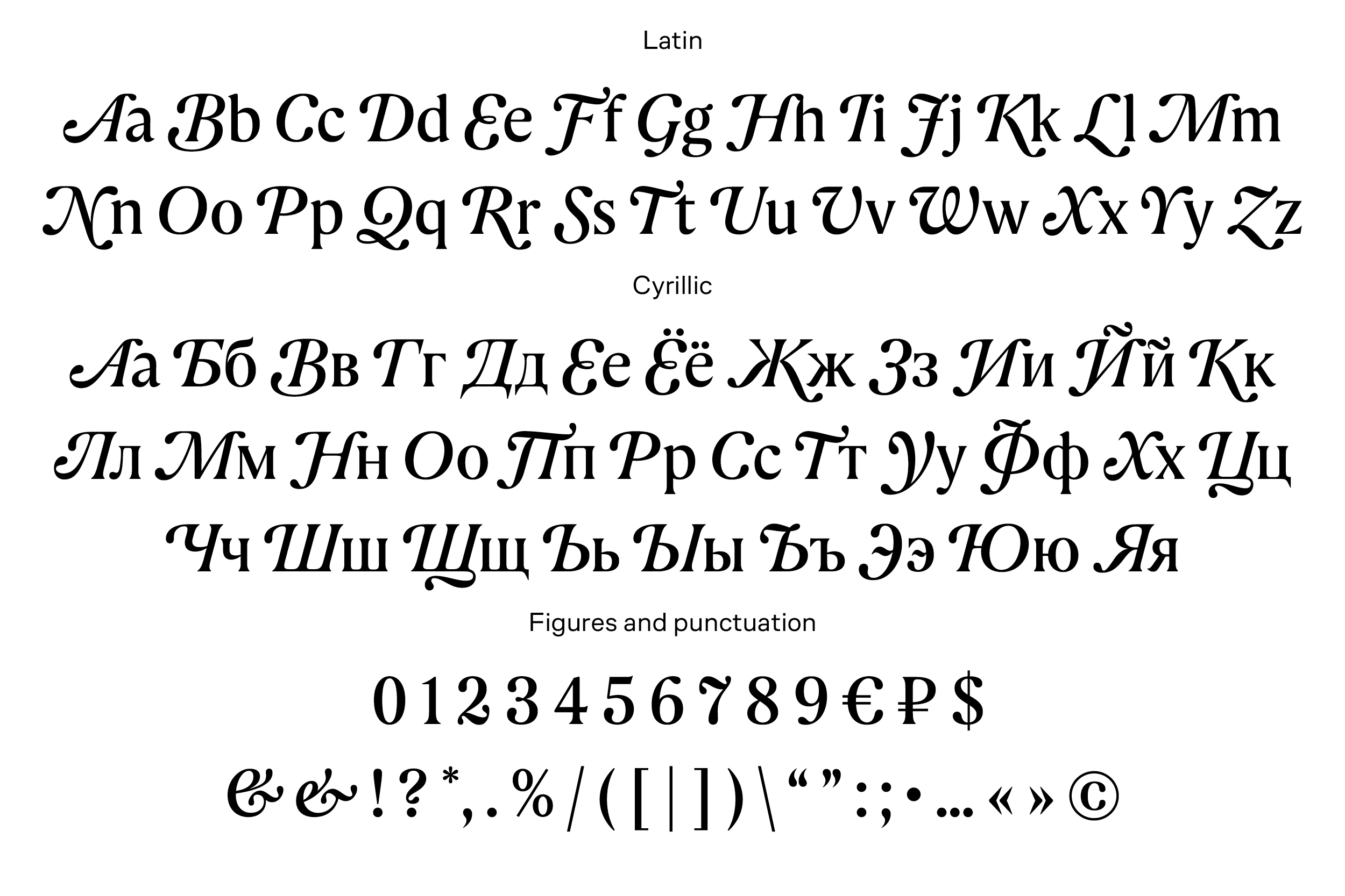
The typeface supports both basic Latin and Cyrillic scripts, including figures and standard punctuation in two styles Roman and Italic. It also includes stylistic alternates and ligatures, making it versatile for multilingual projects.
Italic Terminal Forms
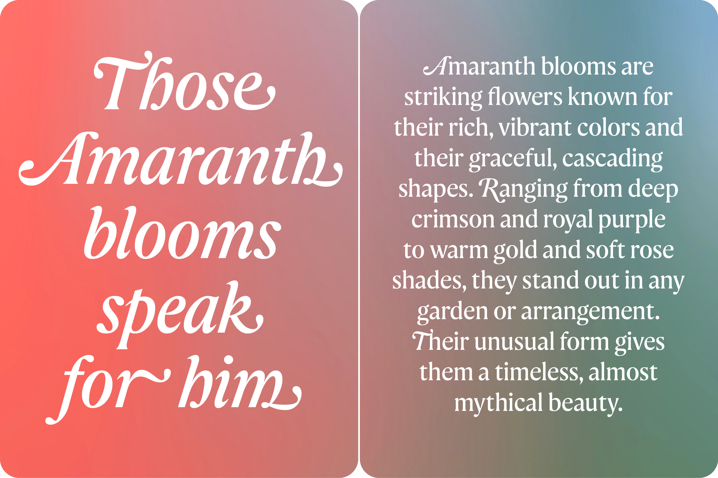
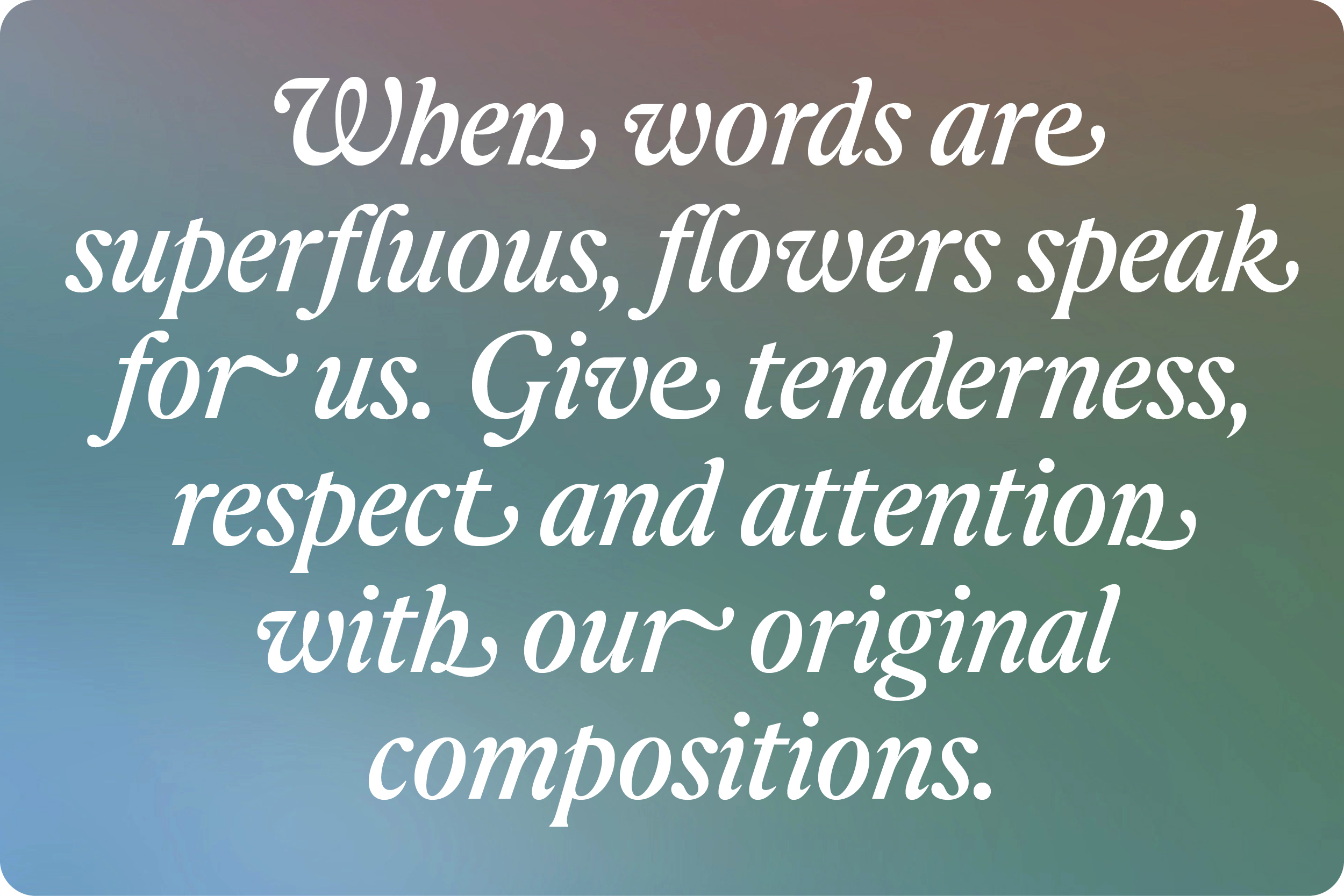
Many italic letters of Flowfont feature flowing terminal forms that can be turned on or off. These forms appear only at the end of a word and do not break the rhythm. Instead, they add subtle accents to short headlines and help balance an initial decorative capital letter. When activated in fully italicized text, they introduce a richer rhythm and add extra charm to the entire block.
I’m incredibly proud of this project and excited to see Flowfont come to life across the Flowwow universe. Onward, with style!
CLIENT
Flowwow
PARTNER
Shuka Design Bureau
Ivan Velichko, Creative Director | Shuka
Konstantin Frolov, Art Director | Shuka
Dasha Buchakova, Design Director | Flowwow
Nastya Ivanova, Head of Brand Design Team | Flowwow
Renata Mikhaylova, Brand Manager | Flowwow
Ira Tatarinova, Brand Director | Flowwow
Sasha Filatov, Lead of Media Design Team | Flowwow
Amir Shakirov, Lead of Product Communications Design Team | Flowwow
Veronika Becker, Lead of Digital Design Team | Flowwow
Katya Polishchuk, Lead of Banner-Making Team | Flowwow
