
YouTube Hebrew. A Typeface for the Streaming Giant
Published on 10.07.2026
I’d like to share my experience of designing the Hebrew script for YouTube! This article is written by a human being with imperfect English, but at least it’s not an AI trash, so don’t worry, I spent more time writing it than you reading.
In the spring 2025, SharpType invited me to design Hebrew for a custom typeface commissioned by YouTube. I was excited and at the same time felt a huge responsibility, knowing that millions of people will see this typeface every day.
By the time I joined the project, the Latin design was already well established.
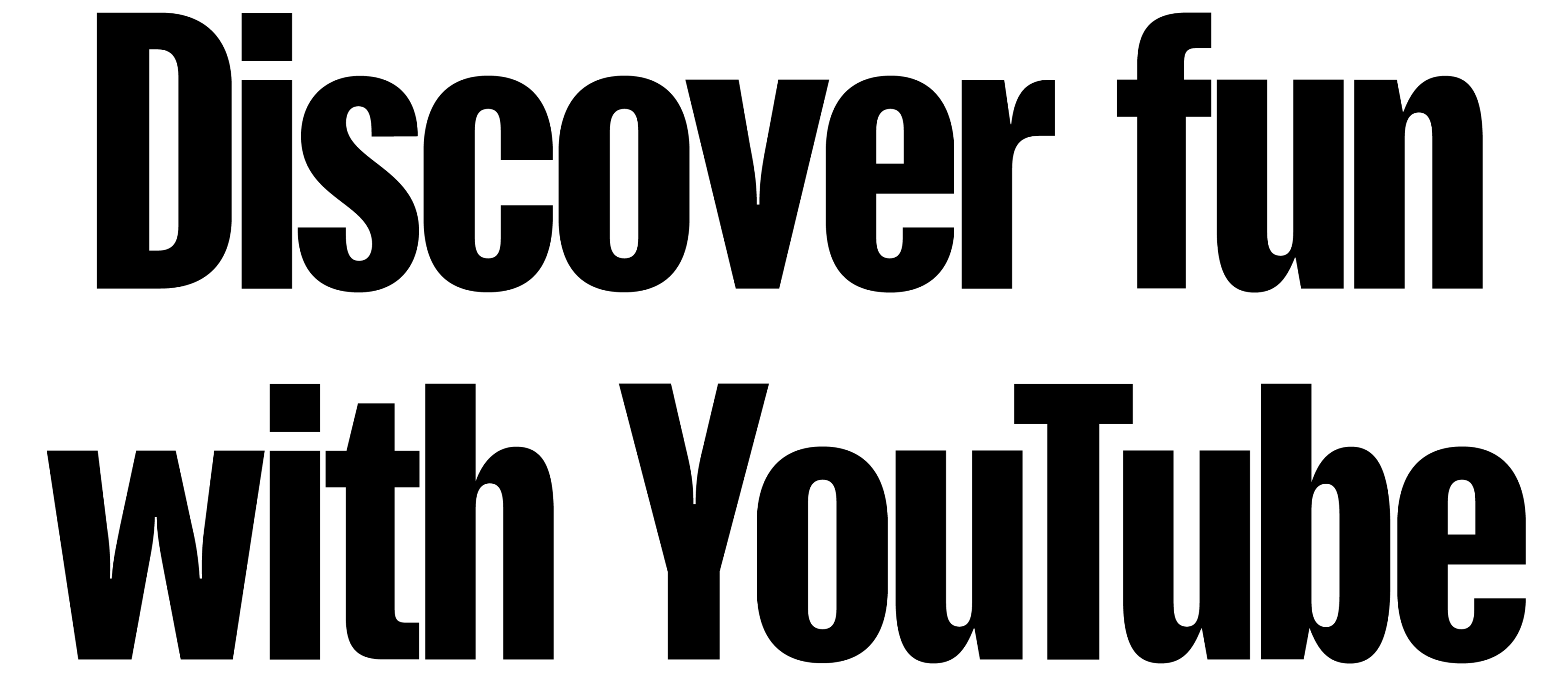
Like most modern custom typefaces, YouTube Sans balances neutrality and personality. It has a simple and neutral structure that allows it to work across multilingual systems. Let’s say it feels recognisably “YouTube” without becoming too loud.
It’s a low-contrast grotesque with narrow proportions and tight spacing. Its character comes from the high-contrast stroke connections and a mixture of geometry and dynamism. The contrast between the squared inner counters and softer outer curves gives it a human yet technological touch (look at the letter o). Letters such as t and f look more geometric, while a, s and r are more dynamic.
A good representation of the streaming giant with a human face.
References
I began with research into historical prototypes and collecting references, as well as studying contemporary Hebrew typefaces with similar goals and characteristics.
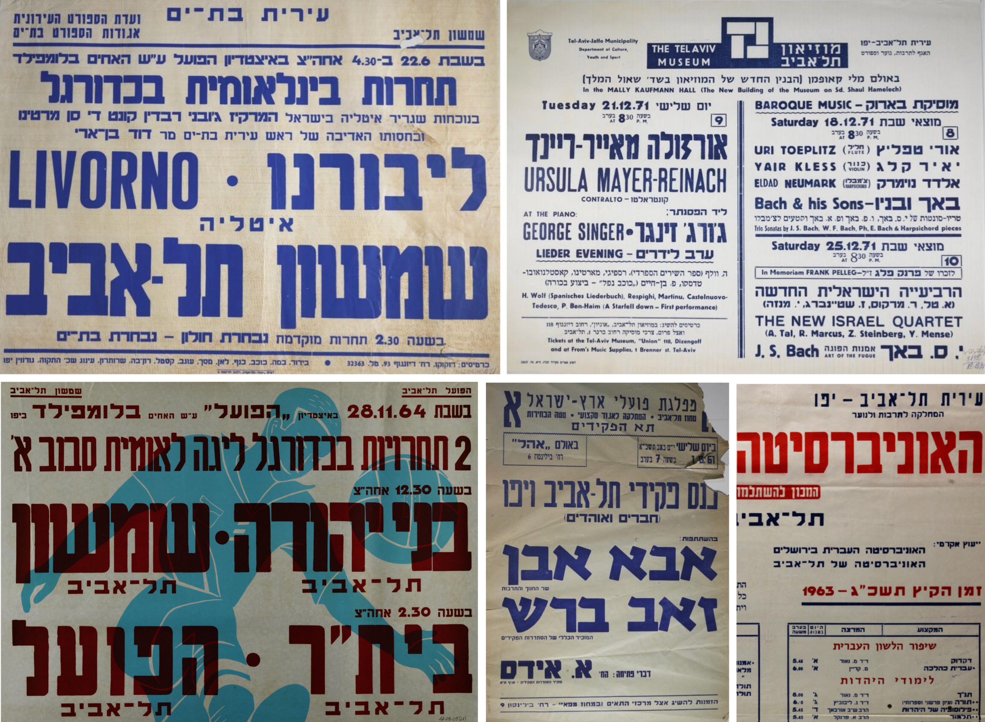
Narrow, industrial-looking typefaces can often be found among wood type specimens across different writing systems. I searched online archives for street posters from Tel Aviv from the 1950s–1970s.
These posters often combined multiple typefaces. Some of them were very close to the qualities I was looking for, while others helped me build a broader visual understanding and overall visual experience. I like to think that music and cinema posters of that period played a role similar to what modern video platforms do today.
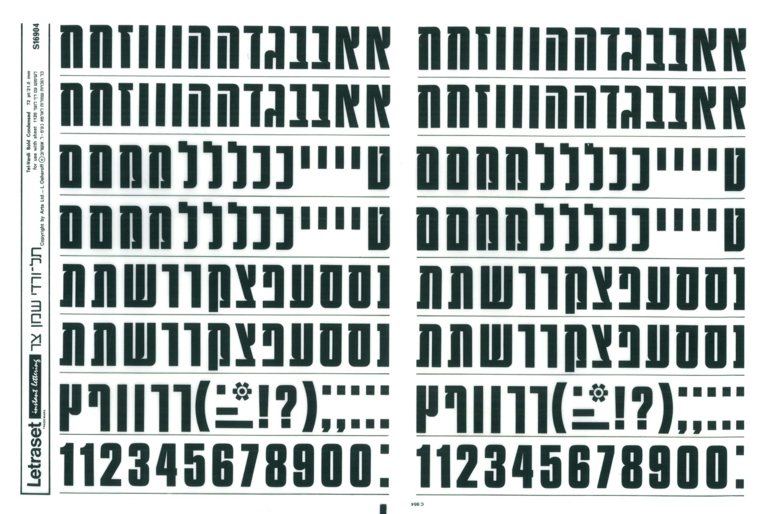
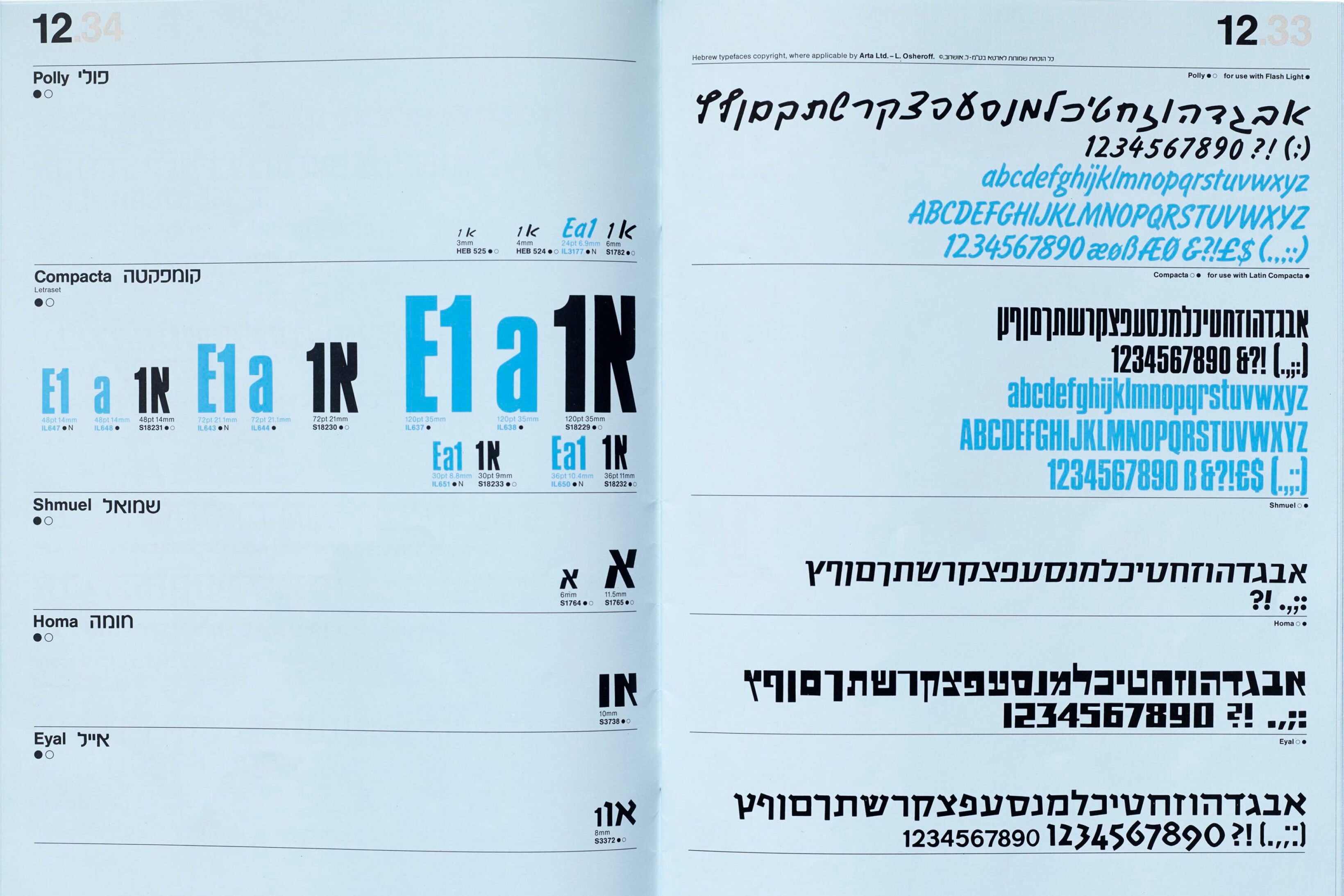
I was interested in how the distinctive details of YouTube Sans could be translated into Hebrew while respecting the logic of the script. I studied typefaces from the Letraset specimen from 1964 as references for different letter constructions that could work in a particular context.
Rhythm
The design process begins with drawing a few key letters and finding harmonious proportions, weight, and Hebrew height in relation to Latin. I start with letters het and samekh. They have simple and fundamental letterforms, relatively close to Latin shapes. Based on these letters I start testing the proportions, spacing and rhythm.
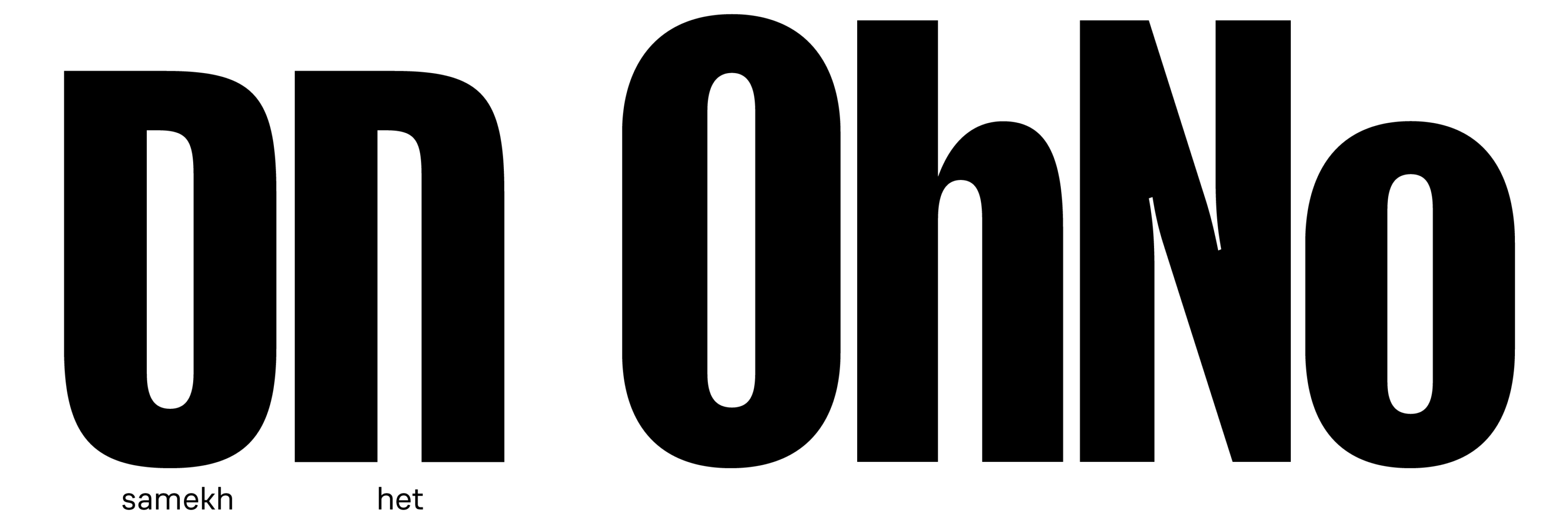
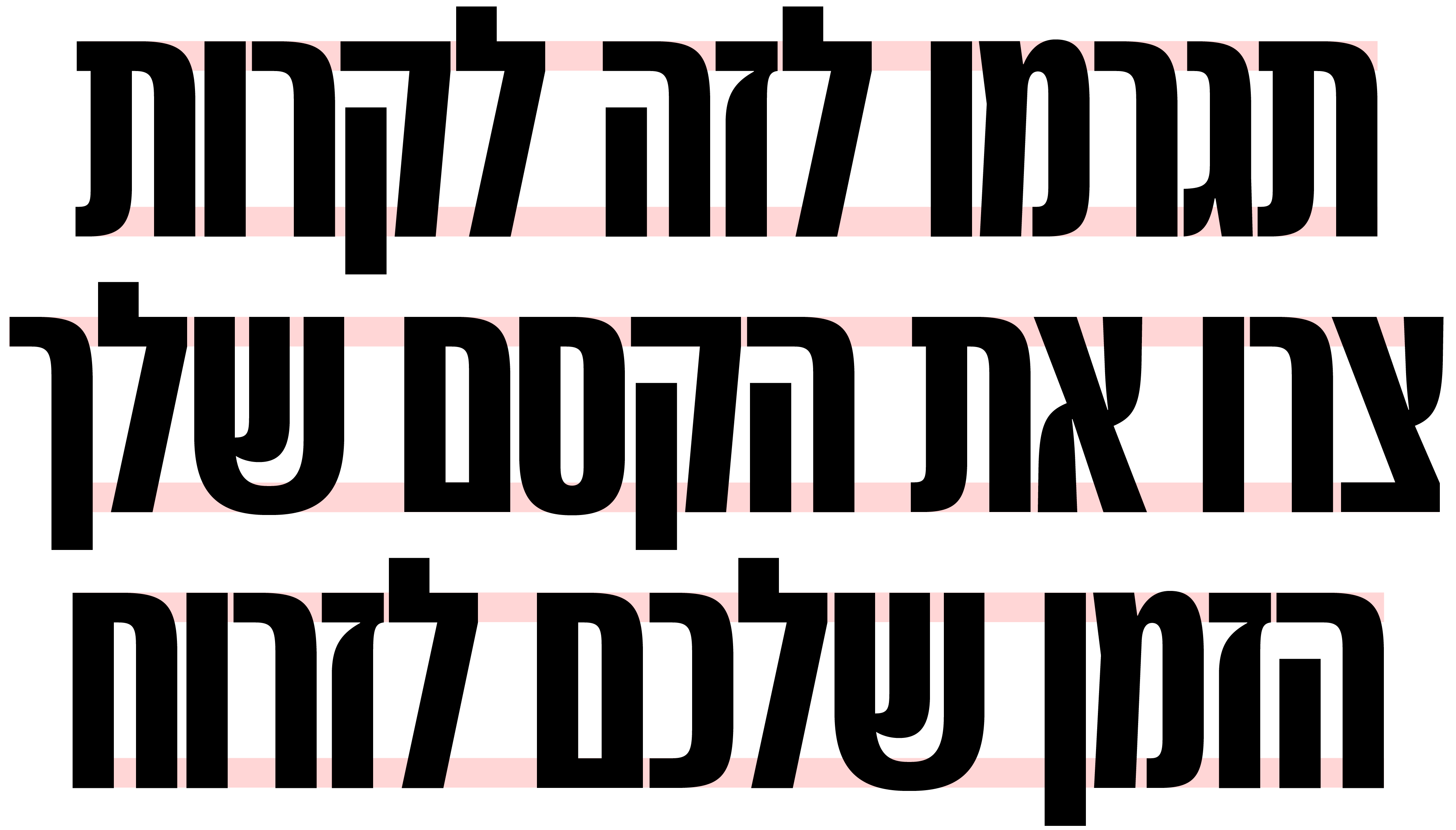
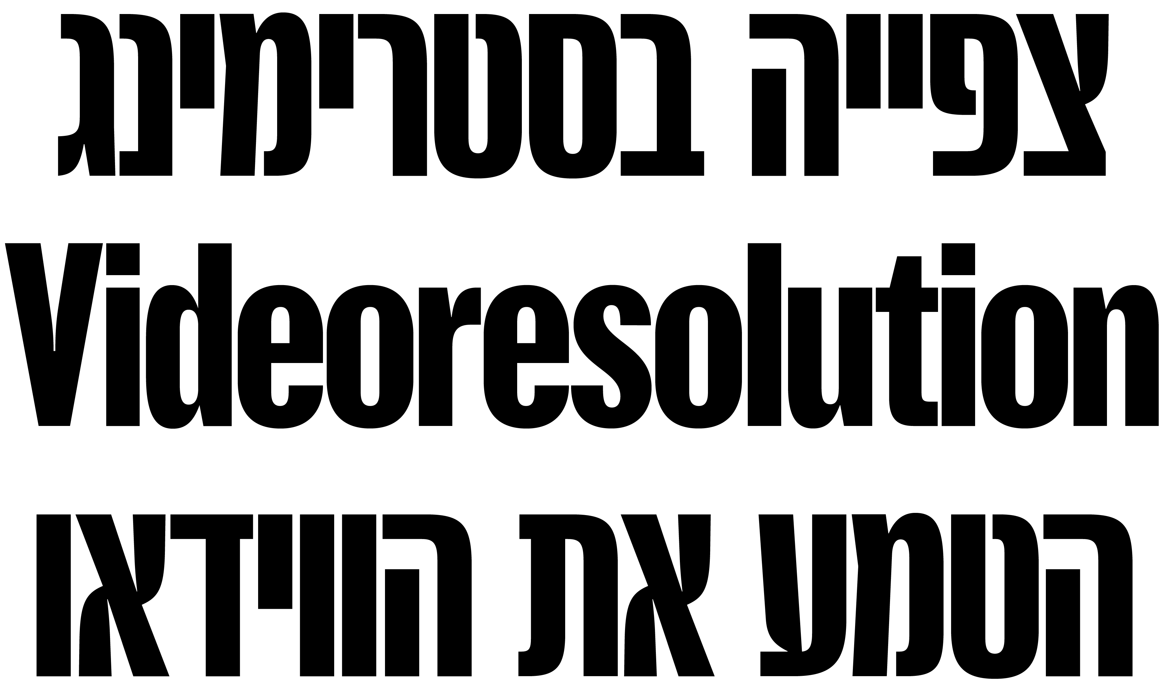
YouTube Sans is a display typeface with narrow proportions that translate well into Hebrew. However, Hebrew rhythm is traditionally built around horizontal strokes rather than vertical ones, unlike Latin. As a result, Hebrew naturally has a more open vertical rhythm, especially in condensed typefaces. This makes Hebrew appear lighter in text when set with the same stroke thickness as Latin. Therefore, I slightly increased the stroke weight.
At the same time, YouTube Sans is designed for short, large-scale text, where even small differences in stroke weight become noticeable. Therefore, the adjustments for Hebrew are very subtle.
Letter height
Hebrew is a unicase script, meaning that it does not have a distinction between lowercase and uppercase letters. One of the important aspects of the project was determining the height of Hebrew relative to Latin.
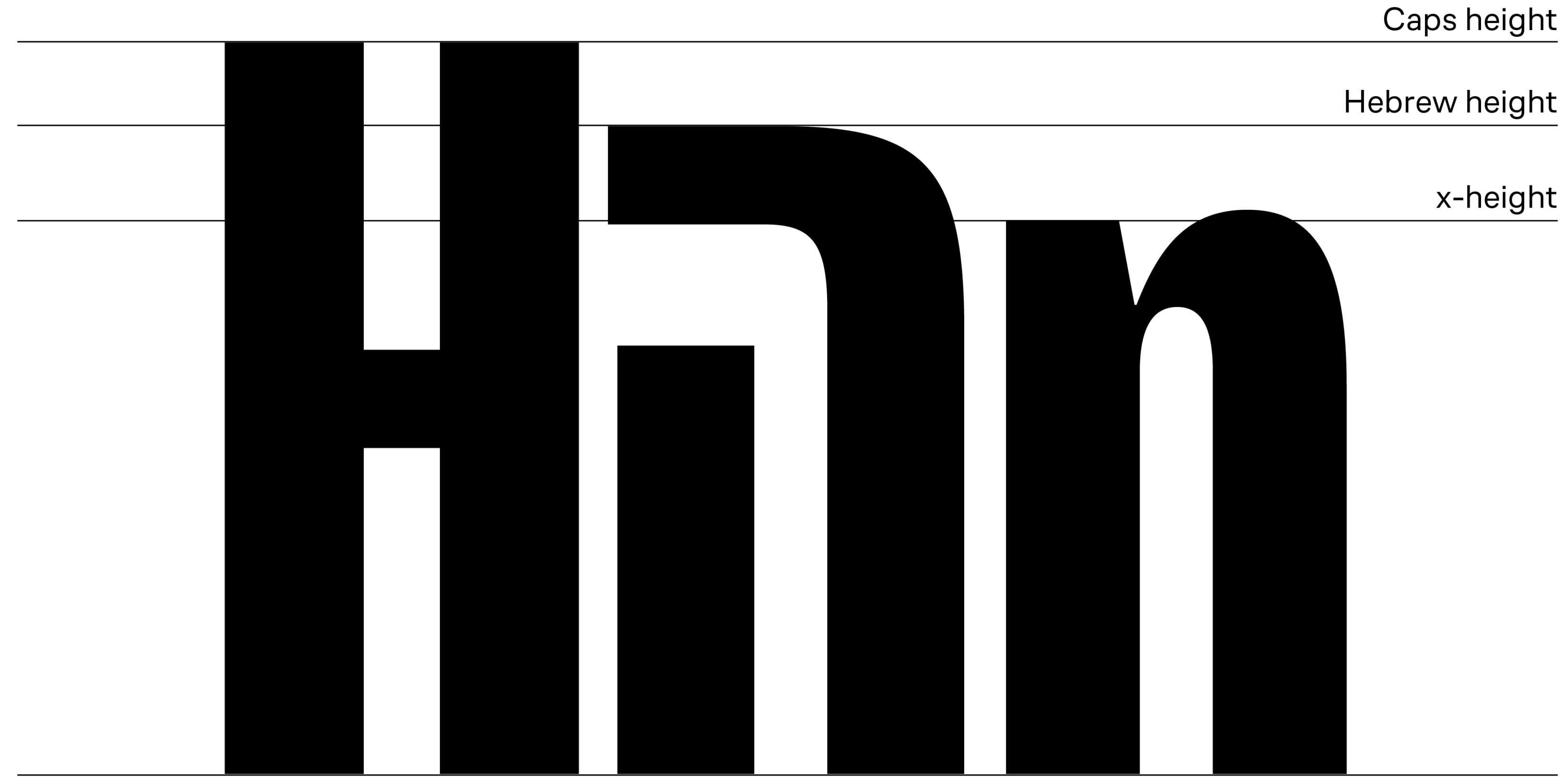
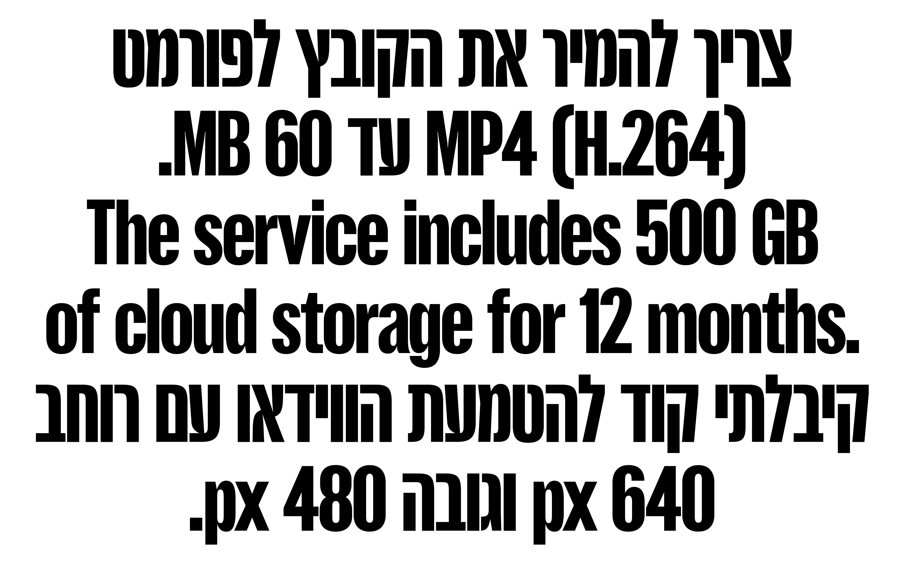
For multiscript typefaces, consistency in overall scale and height across different scripts is an important feature. It allows users to set texts in different scripts harmoniously. Even when Hebrew and Latin do not appear directly next to each other, numerals and punctuation marks are an integral part of Hebrew text, and modern Hebrew often includes occasional Latin letters and words. Therefore, I made several tests to find the ideal Hebrew height.
Spacing and proportions
One of the defining characteristics of YouTube Sans is its narrow proportions and tight spacing, and it was important for me to preserve these qualities in Hebrew.
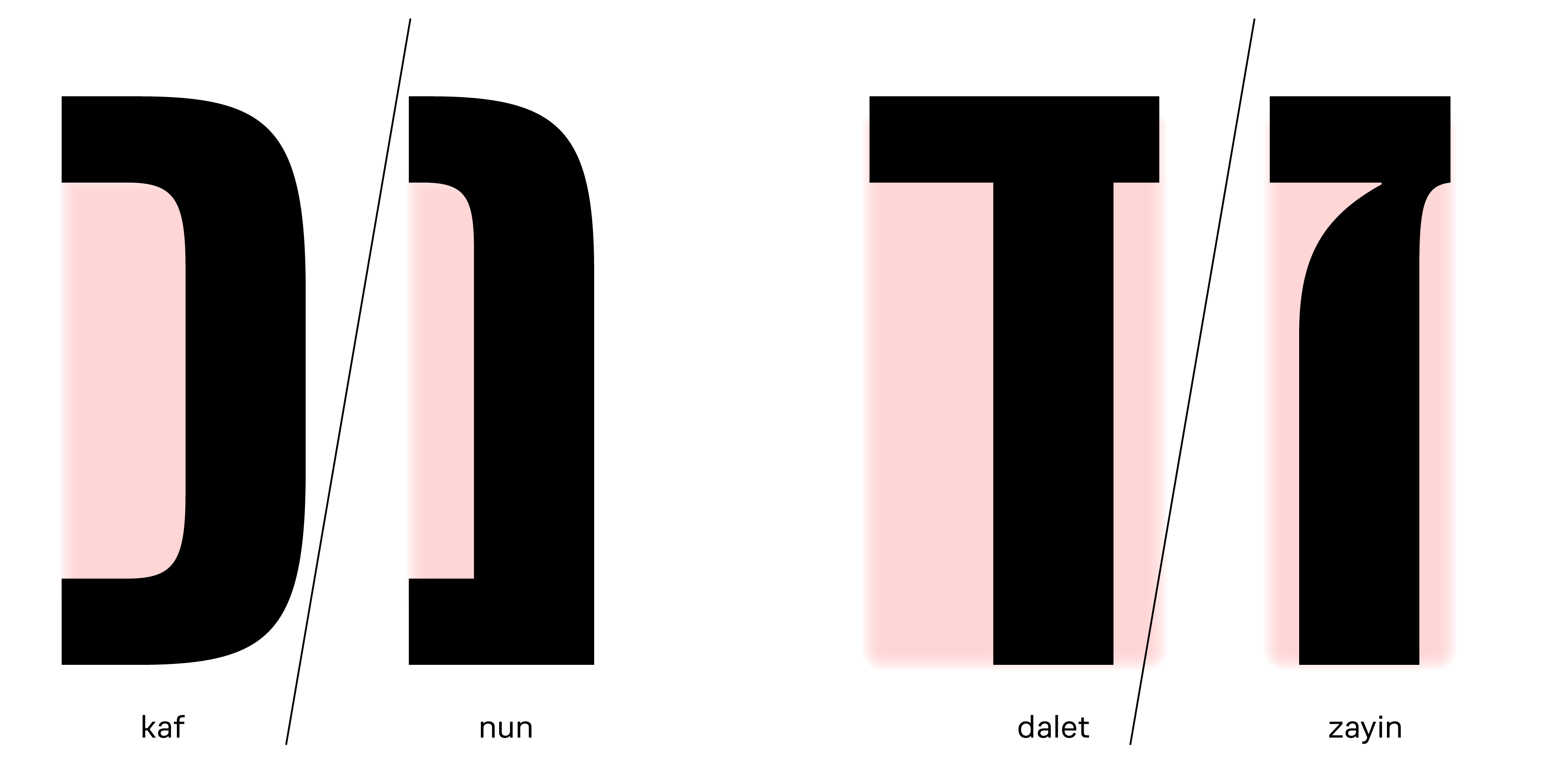
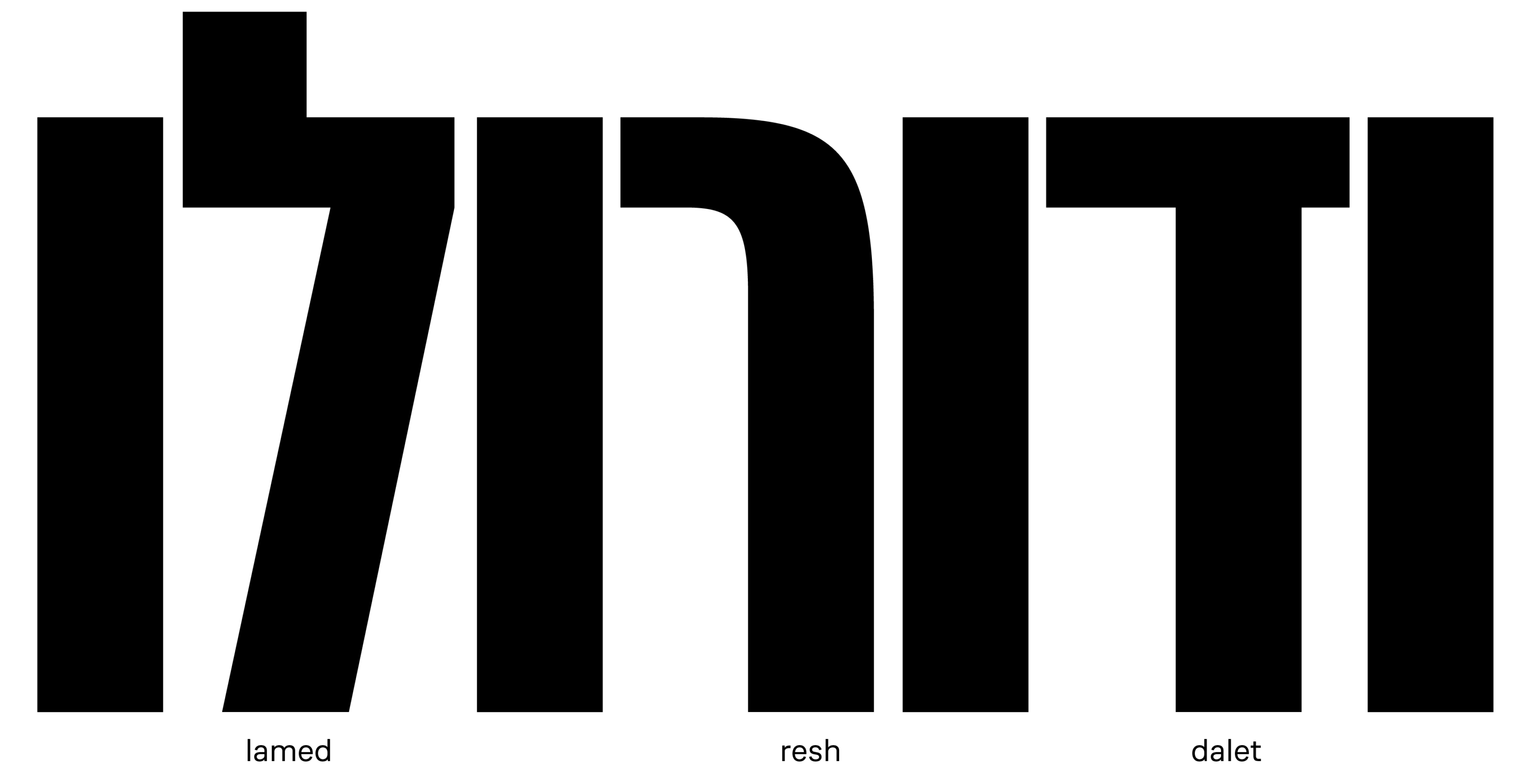
At the same time, very narrow proportions and tight spacing are not typical characteristics of traditional Hebrew typefaces. In Hebrew, several letters are mainly distinguished by their width. They have a close construction and vary by the amount of white space inside. In other letters, a large amount of open internal space is an essential part of the letterform.
Kaf and nun have similar structures, but nun is significantly narrower than kaf.
Dalet and zayin have quite a similar construction, but dalet is a wide letter, while zayin is narrow.
The difference in proportions make these letters recognisable in small sizes.
Since the typeface needed to be as compact as possible for short headline settings, I was looking for a balance between making the letterforms as narrow as possible while maintaining readability and staying faithful to the underlying letterforms.
Character-defining letters
I roughly divide Hebrew letters into two groups. The first consists of the most frequently used letters that form the overall texture and impression of the text, such as he, het, bet, tav and final mem. These are the letters I use to establish the relationship between Hebrew and Latin in terms of proportions, letter height, weight, and overall colour.
The second group contains less frequent letters where the typeface’s personality can be expressed more freely.
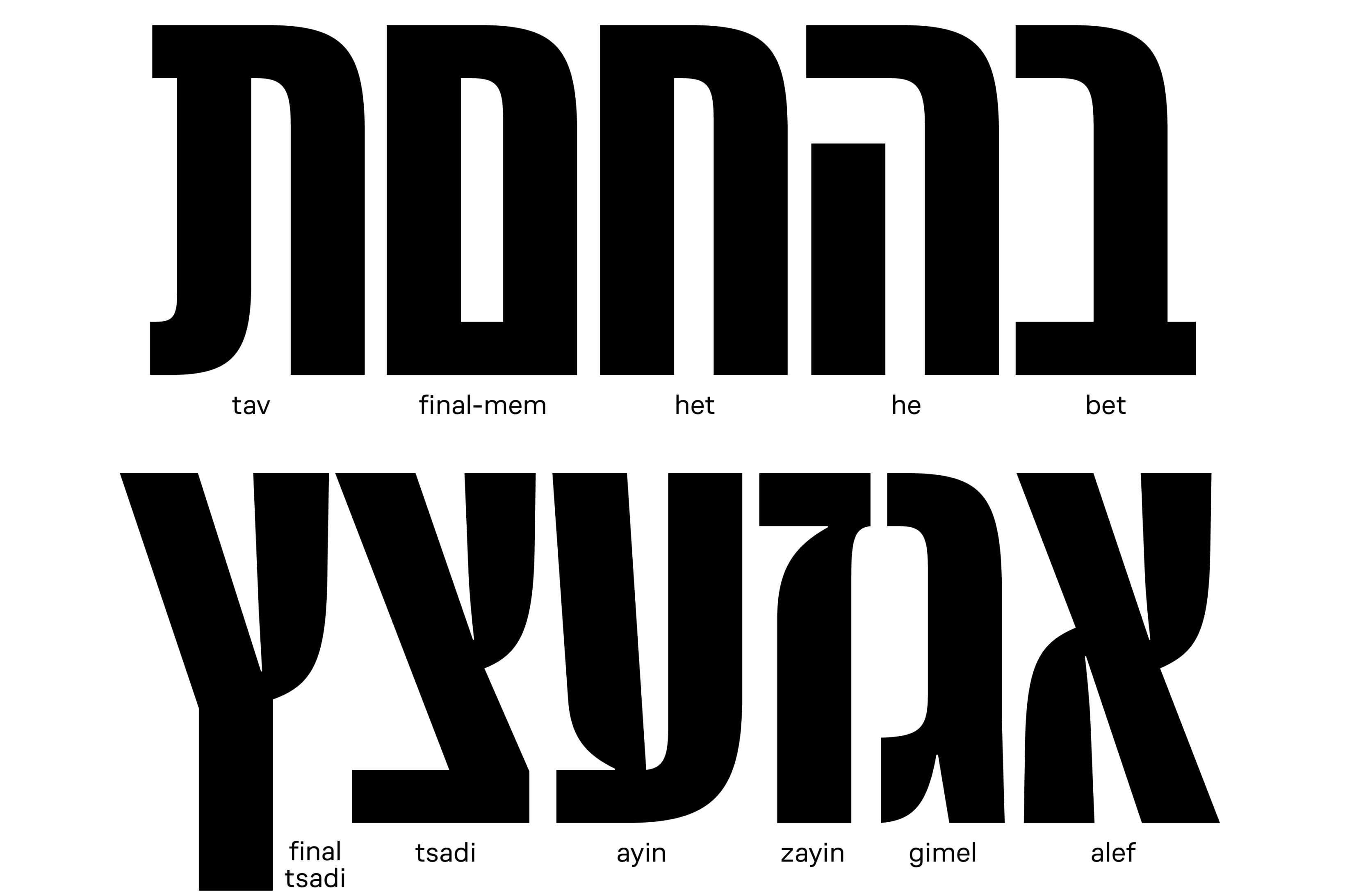
One of the defining characteristics of YouTube Sans is its high-contrast stroke connections in lowercase, such as d, u, n. I was interested in finding the way to naturally translate this feature into Hebrew. Early in the process, I developed the idea of smooth yet high-contrast stroke connections in alef and tsadi. Then I extended this approach to other, less obvious letters, creating a coherent system of distinctive details that ties the entire Hebrew design together. At the same time, it was important that the script did not become overly decorative and remained a functional reading tool.
As a result, these high-contrast stroke connections appear primarily in the group of less frequent letters, where the typeface’s character can be expressed more strongly. In YouTube Sans, these include alef, gimel, zayin, ayin, tsadi and final tsadi. They allowed me to introduce the sharpness, clarity, and distinctiveness that already define the Latin design.
Challenging letterforms
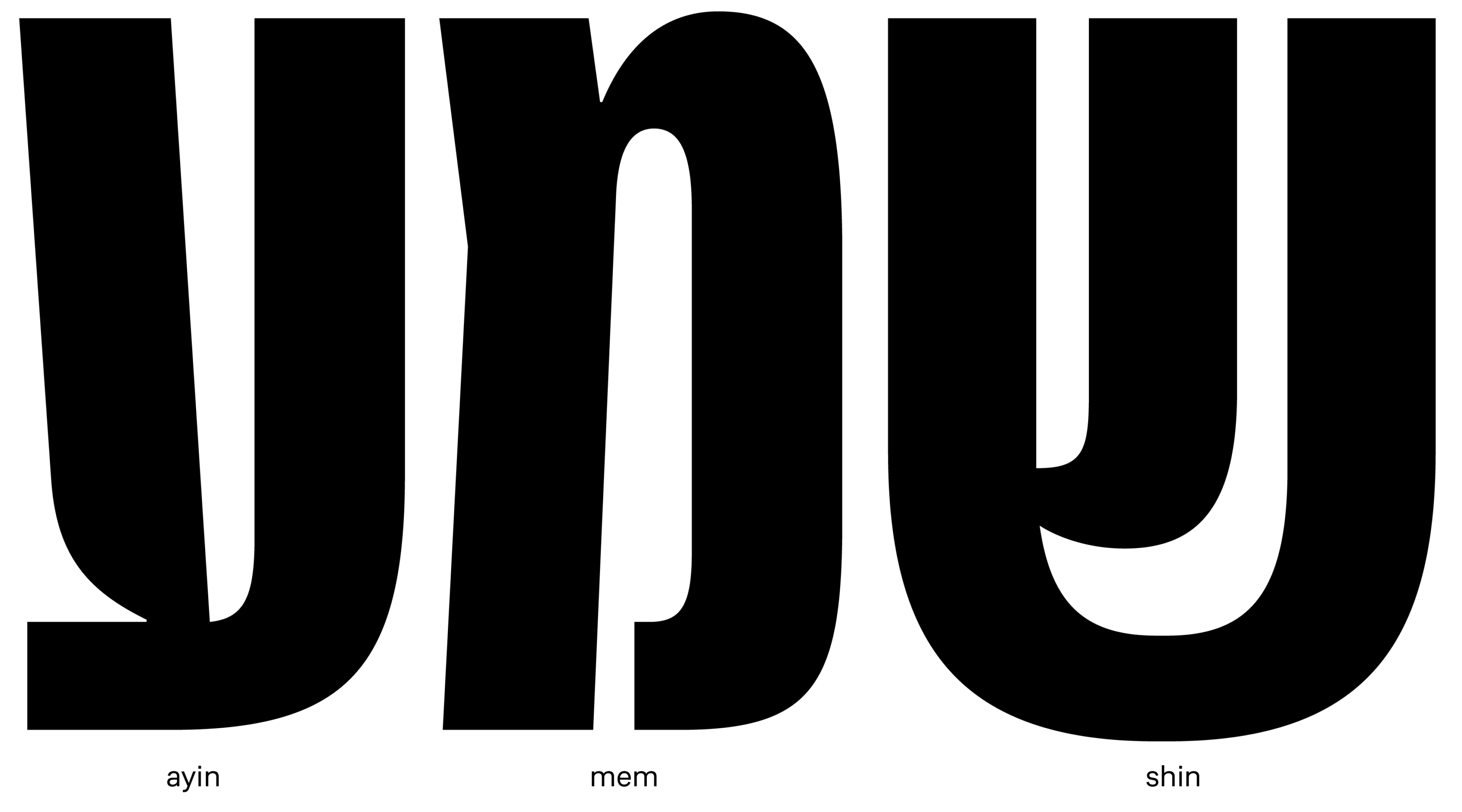
The most challenging letters for me were shin and mem. Their constructions called for contrast, but in a way that differed from the other expressive letters. I explored several solutions, searching for the right degree of contrast in the stroke connections. The letters should feel natural within the text while still preserving the overall character of the typeface.
One of my favourite solutions is ayin. Its stroke connections could easily have remained straightforward, but introducing contrast made the letter more distinctive without making it stand out from the rest of the alphabet.
Spacing and kerning
Unlike in Latin, where spacing and kerning are often treated as separate stages and kerning is usually left until the final phase of the design process, in Hebrew these two processes are closely interconnected. This is largely due to the many open letterforms, such as dalet, resh, and kaf.
As a result, I developed kerning alongside spacing from the very beginning, treating them as a single process rather than two separate tasks. Although this approach is more demanding, it also feels more natural, as it allows the balance between letterforms and interletter spacing to develop organically.
Niqqud
The final stage of the project was adding niqqud (Hebrew vowel marks) and kerning glyphs with niqqud.
Unlike Latin, Hebrew does not have dedicated letters for most vowels. Instead, it uses niqqud—small marks placed around the letters to indicate vowel sounds.
Fun fact, you probably won’t see them on YouTube. Niqqud is used mainly in religious texts, children’s books and dictionaries, where accurate pronunciation is important. But they’re there if you need them!
Most niqqud marks are positioned above or below the letters. Some, however, appear to the left of the letter, making it important to test how these combinations behave within words and how they affect spacing and kerning.
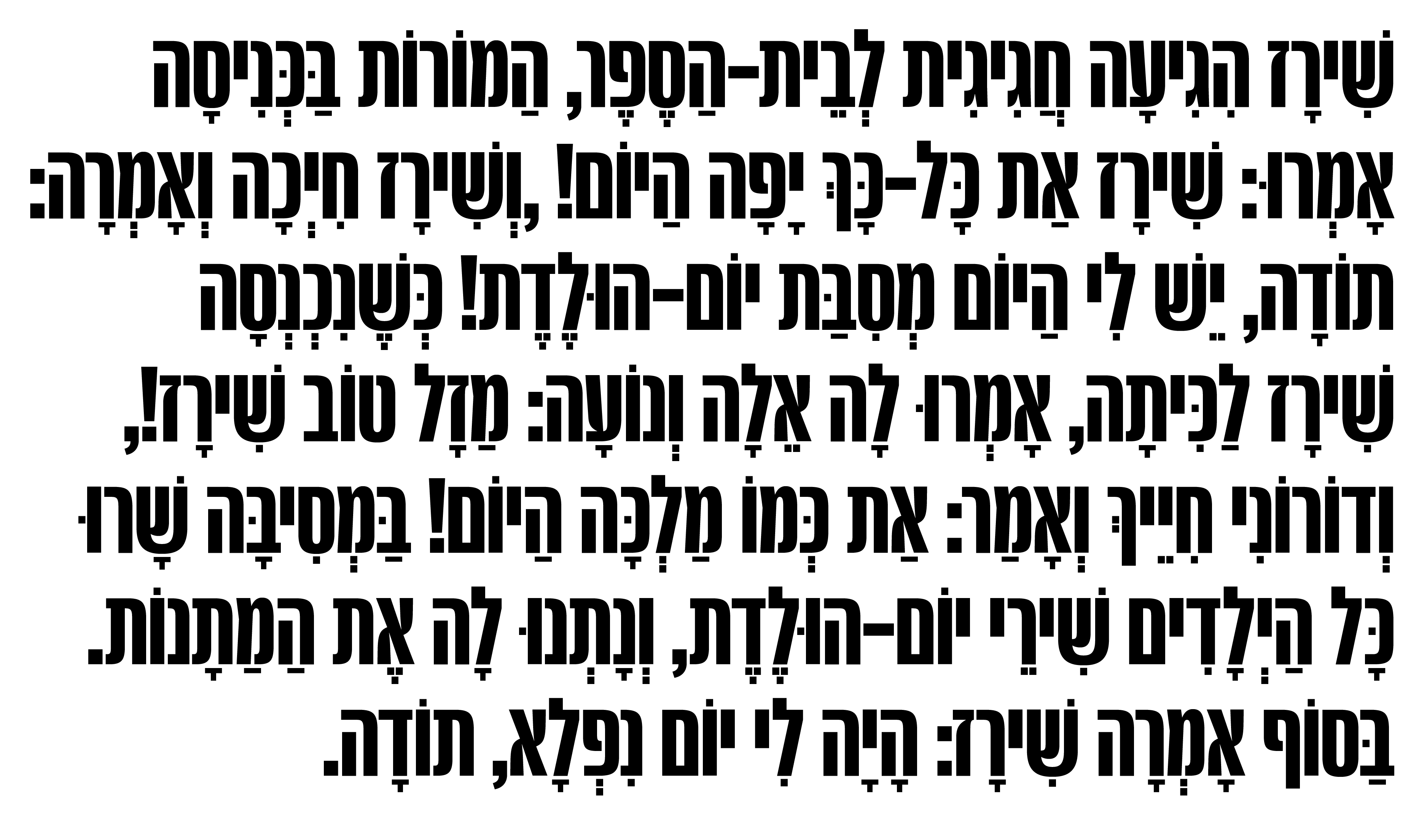
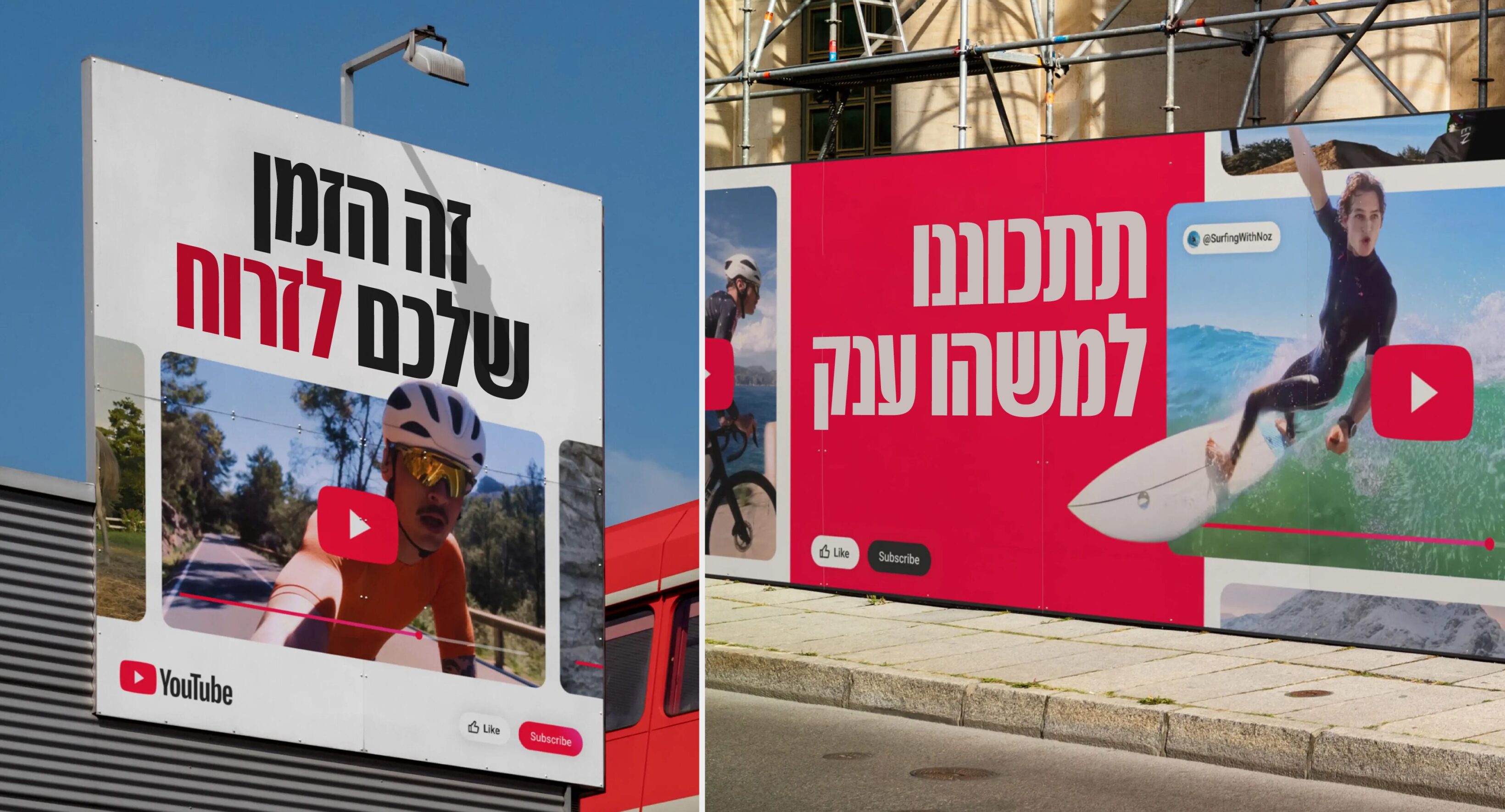
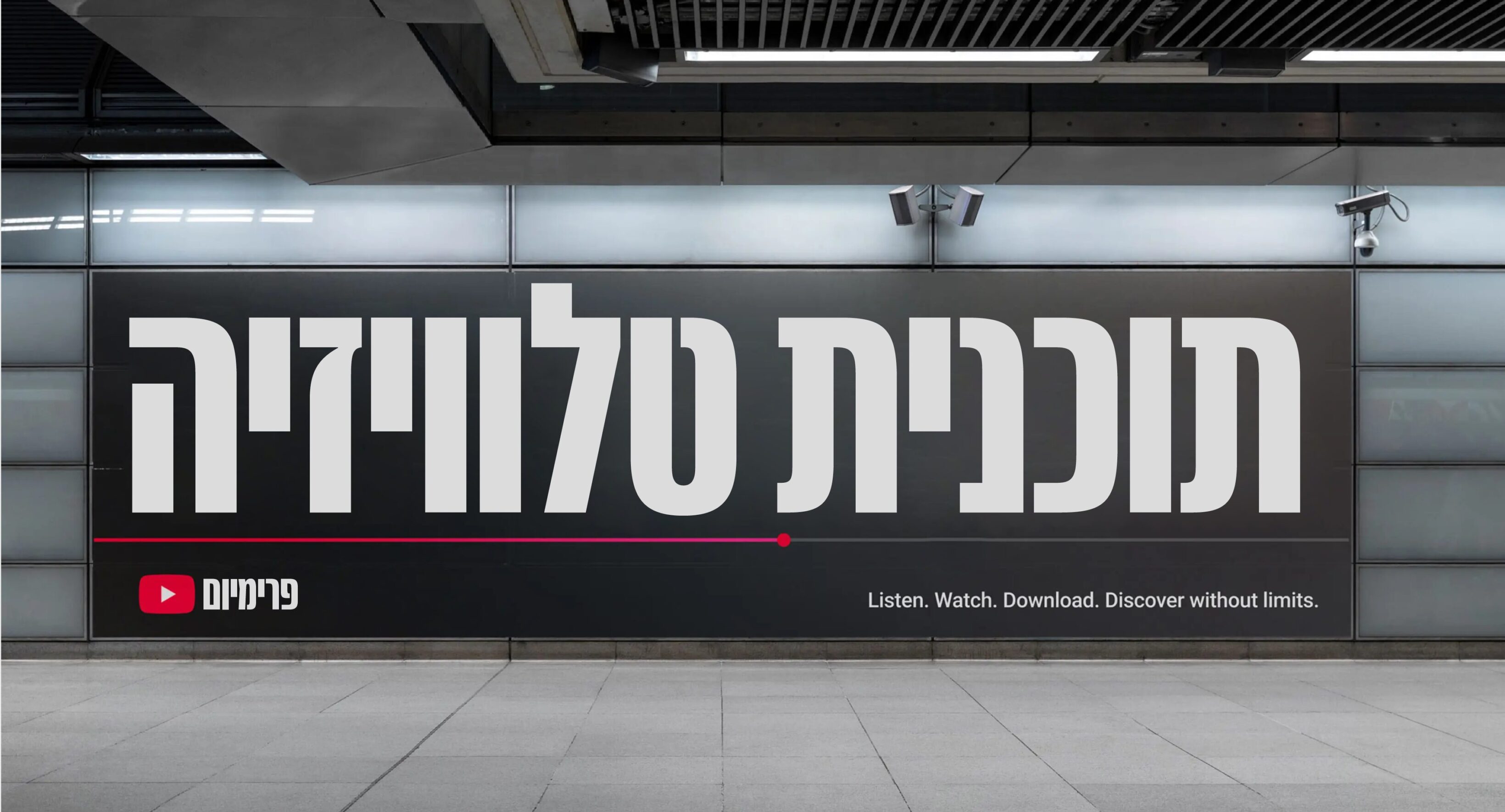
YouTube Sans Hebrew is a fully developed Hebrew script designed to work harmoniously with other languages and intended for impactful headlines and short slogans. Exclusive on YouTube!
Daniel Grumer and Yanek Iontef for sharing their knowledge of Hebrew and providing invaluable consultations.
Lukas Sharp for inviting me to the project and trusting my design decisions.
YouTube for investing in a beautiful new multilingual typeface.